H466 Angora
Color of the Year 2017: A soft beige Angora is not a loud statement, but a fresh and beautiful color for any surface. Angora exhales effortless French charm. Discover the Color of the Year 2017!


Color of the Year 2017: H466 Angora exudes French charm in a timeless style. Angora is not a loud statement, but a beautiful and fresh universal color that suits many homes and moods. Angora is a practical neutral choice, never boring or flat.

Photographer: Riikka Kantinkoski

Photographer: Riikka Kantinkoski
This year, the jury for Tikkurila's Color of the Year and 2017 color collections included fashion designer Teemu Muurimäki, interior designer and blogger Susanna Vento, and Tikkurila's Design Manager Marika Raike. The color selection was based on moodboards created by the jury members, in which they selected their favorite colors and materials. The moodboards featured English manor romance, rustic craftsmanship, and factory milieu aesthetics.

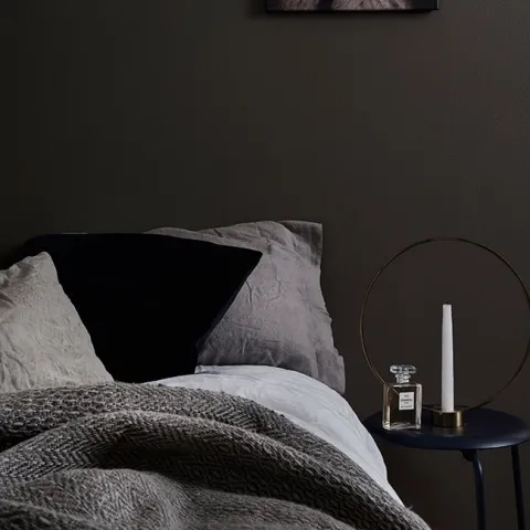
Exhale a dreamy world of the past with muted tones. The color collection includes sophisticated shades that exude English manor romance. The mood of the broken and faded color tones leads thoughts to the ornate salons and rooms of the TV series such as Downtown Abbey, where people sip sherry by the glow of the fireplace.
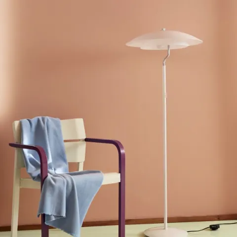
Deep masculine tones combined with sensitivity. Nude, pastel, moss, washed-out faded pink alongside grey. Sicily, whose colorful surroundings at first confused me, but soon gave me great inspiration.

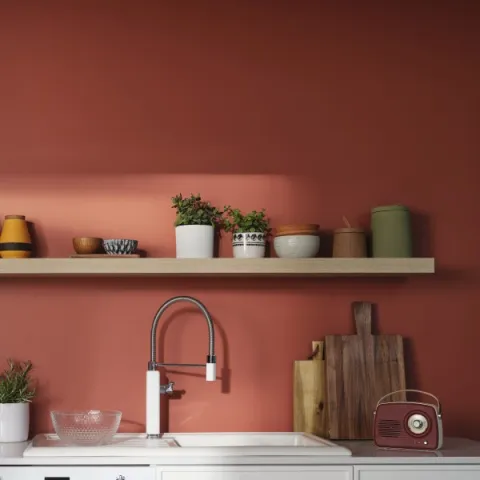
Burnt red tones of terracotta, earthiness, warmth and a washed-out, faded color scheme. The rustic collection reminds us of our roots and our connection to nature and creating things with our hands. A favorite among interior designers, warm terracotta looks especially good with gold and metallic colors.
Faded and washed out tones, gold and metallics, coral, seashell, light red, earthy tones, combining tones, and large painted surfaces instead of accent walls.

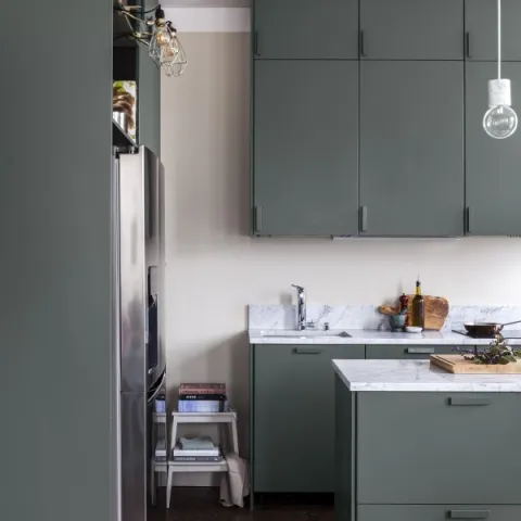
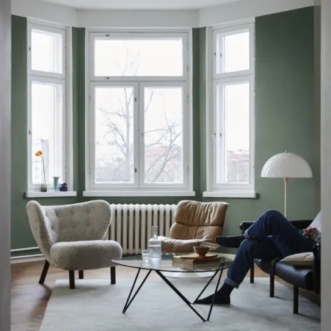
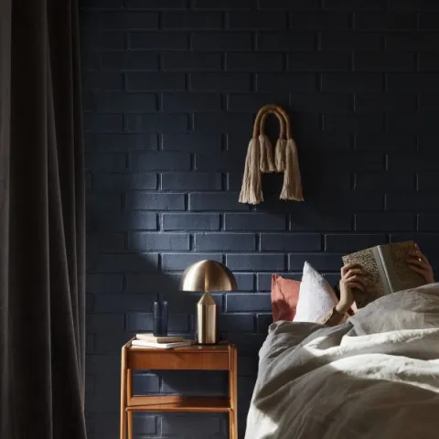
Combine a bohemian soul world and a decayed factory milieu aesthetic in urban jugle. Deep shades of green glow in the tones of a city taken over by nature, contrasting with the rough Tomato and cool Peppercorn. The lightness of Peppercorn, with its yellow tinge, creates faith in the future and suggests a new beginning.
Faded gold, decayed beauty, organic shapes, Nordic nature and well-being, pastels, dirty denim and petrol, pale and washed tones. Industrial meets boho – Berlin and Brazil, where sloppiness, relaxation and colors meet.

With the Colour Master app's wall painting feature, you can see in advance how our colours would look on your walls. Upload a picture of your room or use the live feature, select the colour you want and see the final result on your phone screen.

You’re visiting Tikkurila website from United Kingdom. Would you like to visit the local UK site?