Hello!
You’re visiting Tikkurila website from United Kingdom. Would you like to visit the local UK site?
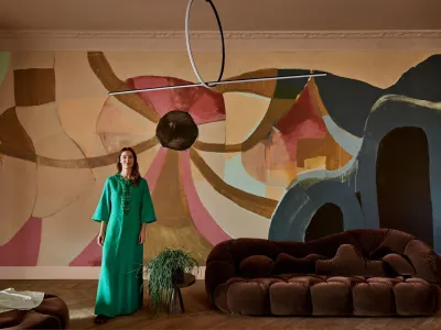
Bold choices and unexpected colour combinations – it’s time to be confident in colour. See how designer Marie Olsson Nylander uses bold colours in collaboration with Tikkurila.

When introducing new colours to our spaces, we usually go for a more traditional look of harmony, preferring, for example, safe, neutral colours that complement each other. However, now is the time to examine our colour confidence and bring in bolder options, even clashing colours.
When looking for your own way of integrating colours into your space, try to approach things from a new perspective. Perhaps you should go for a more intensive option. Or combine the more familiar choice with a vibrant tone.
In her recently collaboration with Tikkurila, Swedish entrepreneur, influencer and designer Marie Olsson Nylander, created the Color Now 2024 collection that consists 14 earthy yet vibrant colours. Nylander used these colours with joy and confidence in her new apartment interior. Find out what might be your next inspiration to go bold with colours at home!

The colours we expect to clash can also create an unforeseen harmony. Don’t knock it until you’ve tried it. Painting is an easy way to try out different looks and bring together colours you usually wouldn’t, such as red shades.
Paint a whole wall with the prettiest pink of Bubba in Berlin to give your space a dreamy hue. If you are aiming for a more matured look, choose the deep, dusty red of Lips in Lyon. If these options are too rosy for you, go for the colour of the year from the Color Now 2024 collection, Nude in Nizza. It’s the perfect powder colour with a darker hue for a cosy atmosphere.


Using bold colours on a room ceiling can be fun for the real interior enthusiast. It adds a unique and dynamic element to any space. A bold-coloured ceiling instantly grabs attention and becomes a focal point in the room. It adds depth and dimension to the space, making it visually interesting and engaging. This can be particularly effective in rooms with high ceilings, as it draws the eye upward and creates a sense of grandeur.

Paint ceiling with rich and yellow toned Gold in Ghana like Marie did, for creating a feeling of warm sunshine shedding lights all over the space. Or, deep brown Coffee in China for a more powerful yet grounded elegance.


Green shades have been a popular choice for recent years. And there is good reason! Green is known for its calming and soothing qualities. Using darker shades, like forest green Men on Mars from Color Now 2024 collection, can add a sense of richness and depth to a room instantly. Marie Olsson Nylander's choice for her washroom goes to the lighter shades of green, Mint in Mexico, creates a serene and tranquil ambiance for an ideal relaxation feeling.
When aiming to grow your colour confidence, the main aspect is to follow your own preferences. Try a splash of colour in a specific spot or start with painting the whole room with the same bold colour. Don’t be afraid of clashing colours or giving new tones a chance. Colour confidence can be discovered in surprising ways.
Tikkurila presents Color Now 2024 collection in collaboration with designer Marie Olsson Nylander. This collection is highlighted with Tikkurila Color of the Year Nude in Nizza.
Read moreYou’re visiting Tikkurila website from United Kingdom. Would you like to visit the local UK site?