V431 Sandman
The right shade of blue can create a feeling of spaciousness or make a room cosy and inviting. As earthy tones recede, ethereal blues inspired by nature are resurging, offering moods from airy summer sky to deep night.

The charm of blue lies in its versatility – whether it's the palest, most delicate blue or an inky navy, blue will bring the walls to life. Depending on the shade, blue can either soothe and create a sense of space, or make the room feel cosy and inviting.
Natural, earthy tones have been the most popular in recent years but now we're seeing a shift towards ethereal blue hues. Blue may not be earthy, but it's certainly associated with nature. Cool, pale blues embody airiness and the feeling of a bright summer sky, while darker tones evoke an atmosphere of the night sky. The colour spectrum of the sea is represented by many different shades.
Blue never goes out of style. Versatile and timeless shades of blue suit a variety of styles and homes. Read on to see our picks from our blue options.


A colour that leads to sweet dreams. An easy and dreamy blue with a hint of grey is the perfect choice for bedroom walls.
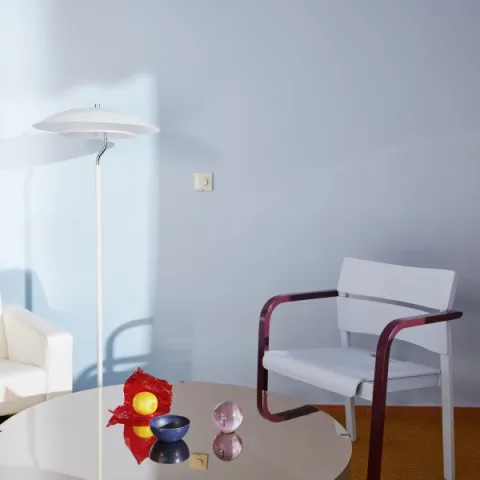
V431 Sandman is a perfect pale blue with a hazy touch of grey. It’s a sophisticated choice for both the bedroom and dining room. Create a dreamy atmosphere by painting the whole room or just one corner.
Sandman looks great when coupled with natural wood, rusty red and black accents, and of course white walls. Sandman is a cosy option: like a perfectly worn pair of jeans, it feels comfortable and homely.

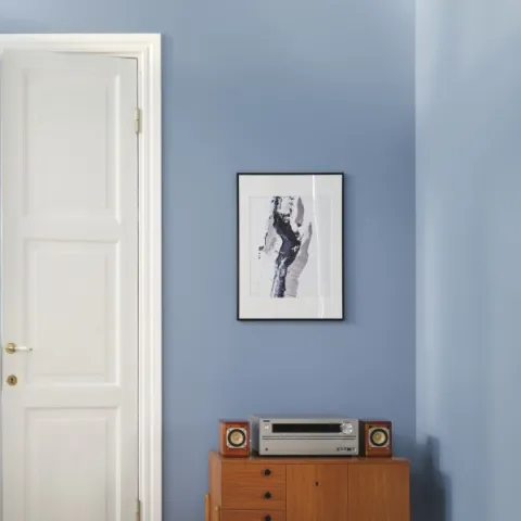
A soft veil of mist over French countryside scenery. Fog is a phenomenon that adds a touch of romance and nostalgia like this lovely light greyish blue.
A cool, greyish, pale blue, Fog in France, has a calming effect. It's serene and restful, making any room feel a little more ethereal – a refined take on light blue.
This shade balances dark colours and wooden materials, and makes the adjoining colours look more vibrant.

Picking forget-me-nots in the grove. This gentle blue is fresh and soft, like freshly washed laundry. Use it as an eye-catcher on small surfaces or paint your bedroom wall for a soothing feel.
Forget me not looks great in the bedroom or children’s room. Brighten up the sweet Forget me not with bold statement colours like S302 Grapefruit or light pastels.

H353 Forget me not is cute and delightful in just the right way. By adding a touch of fiery, intense M339 Tango, the room is set into a sophisticated yet vibrant atmosphere.
The classic Indigo is blue at its best. This mystical broken colour includes a touch of grey. Use Indigo to create a relaxing space in your home.
Classical L429 Indigo looks gorgeous from floor to ceiling. In short, it’s stunning. It creates a sophisticated look and cosy feel at the same time.

Elegant and playful, Indigo is equally at home in the bedroom, nursery or dining room. Or, if you’re looking for some depth and visual impact, paint your kitchen splashback with Indigo by using Tikkurila Luja Ceramic Tiles paint for interior ceramic tiles, as shown in the image below.


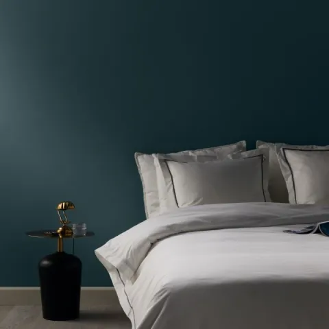
A classical shade of petrol is composed of blue and green tones. Petrol creates intimacy in a bedroom or dining room, and frames your furniture beautifully.
There’s a sense of mystery and elegance to this rich and deep colour wavering blue shade. Refined and elegant by nature, petrol will enhance your interior and add a touch of luxury.
Depending on the light, petrol can appear more bluish or greenish. It will combine perfectly with black and white and colours of wood.

You’re visiting Tikkurila website from United Kingdom. Would you like to visit the local UK site?