V413 Rosy moment
Red is your muse, whether you want your space to be soft, immersive, intense or harmonious. Find your perfect shade of red among these five beauties.

Stimulating and powerful, cosy and warm, or light, fresh and cute. Red is a bold colour with a lot of possibilities. Use red to create a cocooning nest-like room, create an accent to frame an interior detail, or just add a flash of heat to the space.
As a passionate colour traditionally associated with love, red is a colour with a lot of feeling. Dark maroon and burgundy radiate warmth and an inviting feel, dark and deep pinks have a touch of playfulness and charm, and muted, earthy tones bring a sense of belonging and rooting to the space.
In bright and intensive shades, red might feel overwhelming. To avoid a dramatic feel, it’s always better to opt for colours that feel welcoming rather than overpowering.
Discover your options for perfect shades of red in our Feel the Color 2020 colour card, or keep reading to see our picks.

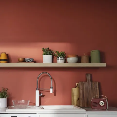
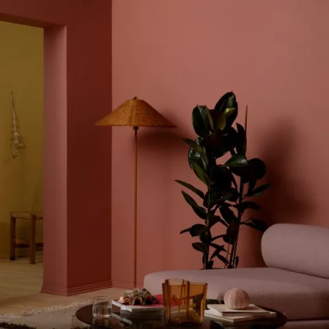
V413 Rosy Moment is cosy and comforting, and highlights the personality of the space. Rays of sunlight playing on the rosy surface bring out the shiny side of this hue.

Rosy Moment is a natural choice for a bedroom as well. In the children's room, this rosy shade adds a playful and sweet vibe.
Light hits the plastered red walls and makes them glow. The intense colour of red soil, burnt clay and warm spices.
The most organic of all reds are those with a strong brown undertone, such as M411 Madras. A tone reminiscent of clay and soil, it is a bohemian and modern shade at the same time. Pair with hints of green and brown, and add some black to sharpen the look.


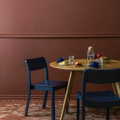
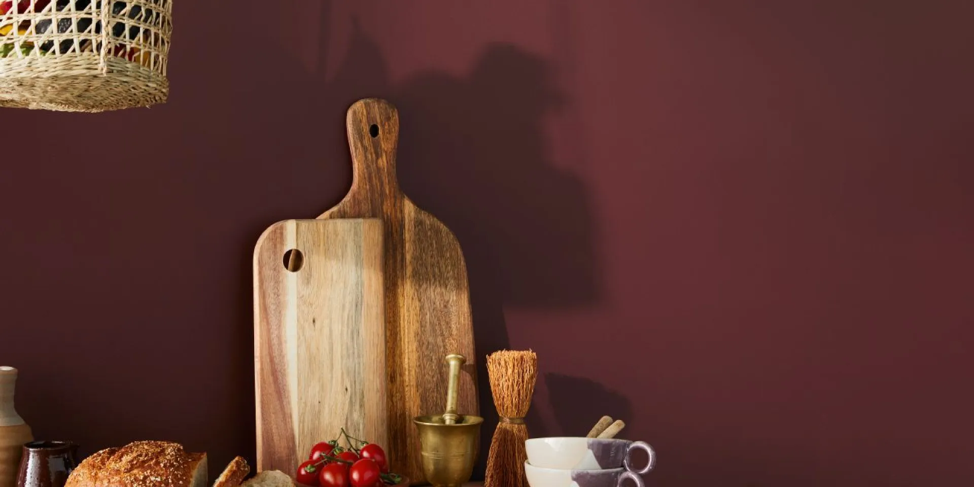
The maroon colour of steamy rooibos tea. A perfect combination of red and brown is at its best in spaces for relaxation and calming down.
On the edge of red and brown, this maroon hue, M476 Rooibos, makes a grounding impact to any space. Try this elegant and rich tone on a piece of furniture if you want to add some character to a neutral toned room, or paint the walls and turn your whole living room into an exquisite spot for relaxing and unwinding.

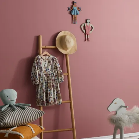
A cold hue shines in the swirl of a pirouette. This intense but calm pink brings harmony to the interior.
Powerful yet soothing pink, V419 Pirouette, is a perfect choice for an accent wall in the bedroom or children’s room – it brings intensity to the room without being too overwhelming. Pair it with beige and ocher to add some warmth.
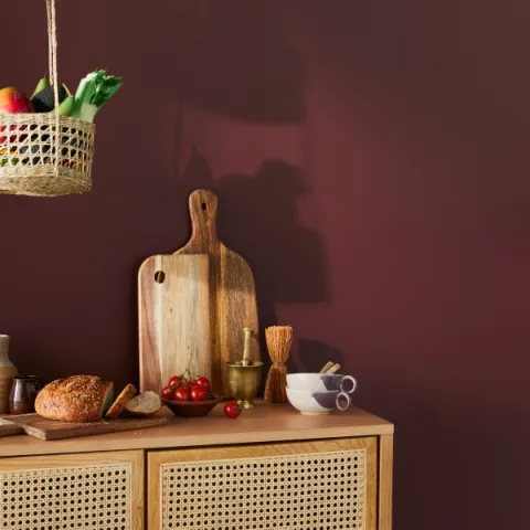
Ripe sour cherries look juicy and plump as you pick them from a tree. The deep crimson colour with a brown undertone is a strong and bold colour that gives depth to your interior.
N417 Cherry creates an immersive effect and pairs beautifully with any wooden tone. Use it as a backdrop for kitchen cabinets or a living room wall full of art.

Add a dash of yellow, and you’ll get instant sunshine. Here are six perfect shades of yellow for different interior needs.
read article
White colour is one of the classic wall colours, and the refined look it gives is loved by many. See a curated collection of our most attractive whites to help you find the perfect one.
read articleYou’re visiting Tikkurila website from United Kingdom. Would you like to visit the local UK site?