Bright, bold and harmonious colour trends of today
Beige, dark blue and a palette of pastels – current interior colour trends are bold and bright at the same time. Take a look at the top five most interesting trends we have spotted from public spaces, which can be easily applied to home decor.
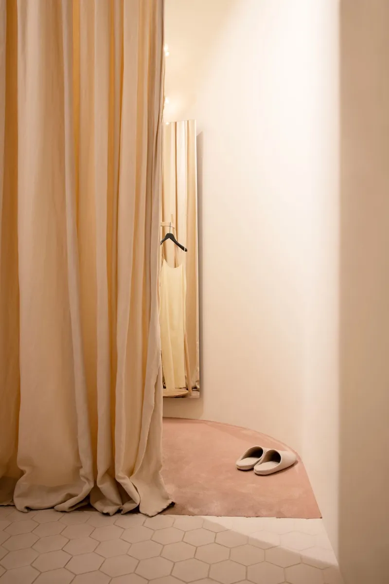
1. Perfectly beige
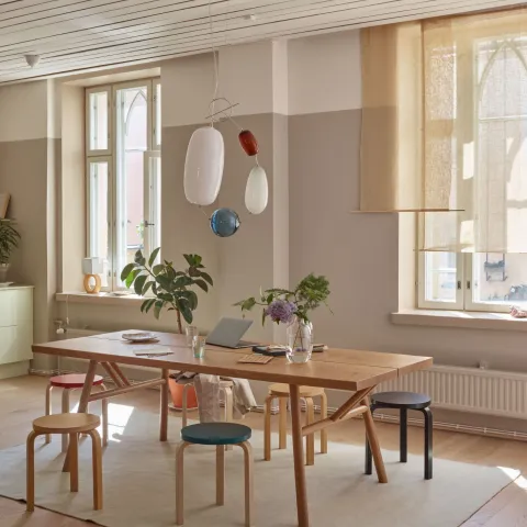
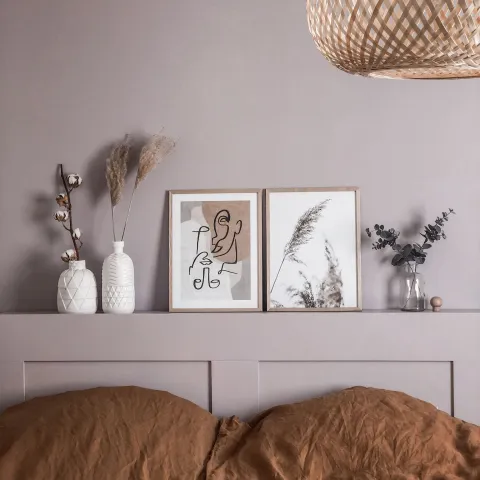
Tone-on-tone styling can help you create a harmonious feeling to any space. Embrace this trend with soft and creamy shades of beige: a multi-purpose colour that has taken the place of grey as a favourite neutral shade.
Choose Tikkurila full-matt Harmony paint when using beige – it creates a beautiful velvet-like effect on your walls. Get creative and combine Tikkurila’s popular shades, Tikkurila Beige, Castle J484 and Sandstone X463 for a serene feeling for your space.
Location: Samuji House, Helsinki, Finland
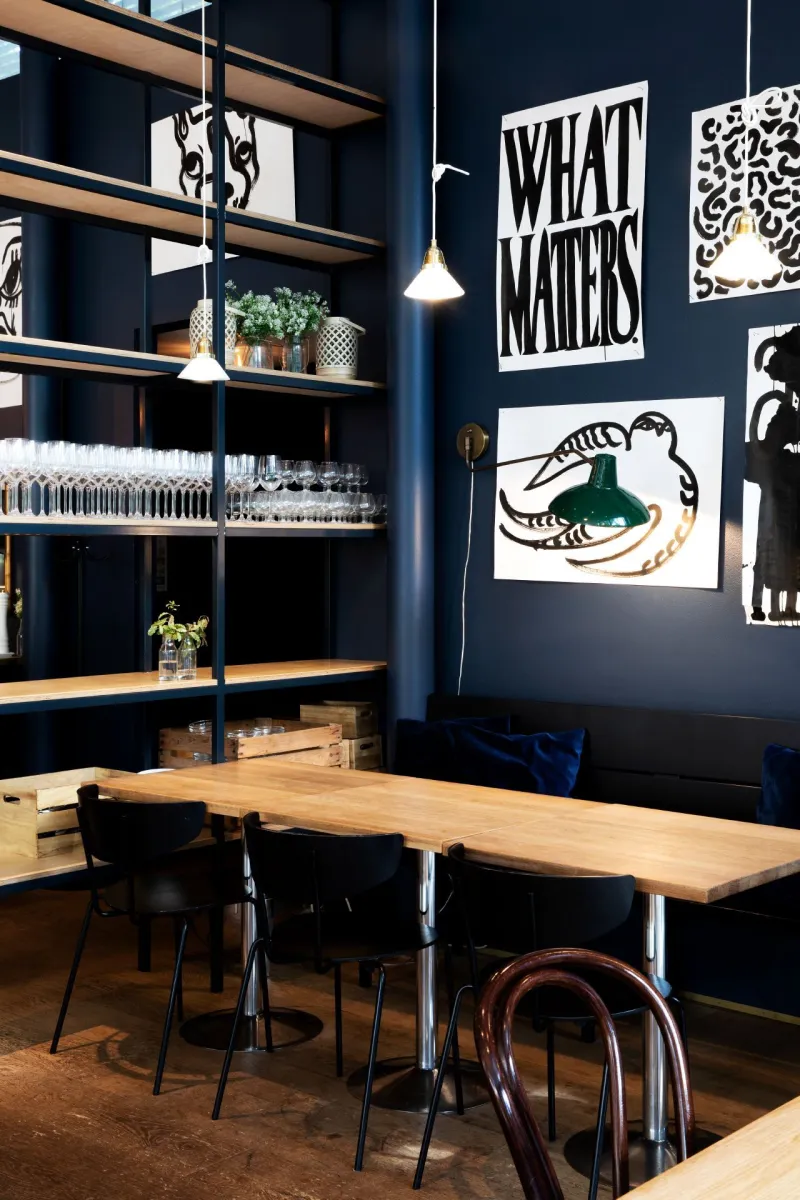
2. Set the mood with dark blue
Classic dark blue as a wall colour is an eye-catcher. Deep blue walls create a moody and intriguing atmosphere. Bright white details with a dark blue background really make the colours’ features pop out, resulting in a unique-looking space. Dark blue never goes out of style and makes for a great choice for workspaces, hallways, bedrooms and dining spaces.
Get playful with dark blue and create looks with these blues of ours: Indigo L429, Ink M350, Denim N429.
Location: Restaurant Southpark, Helsinki, Finland
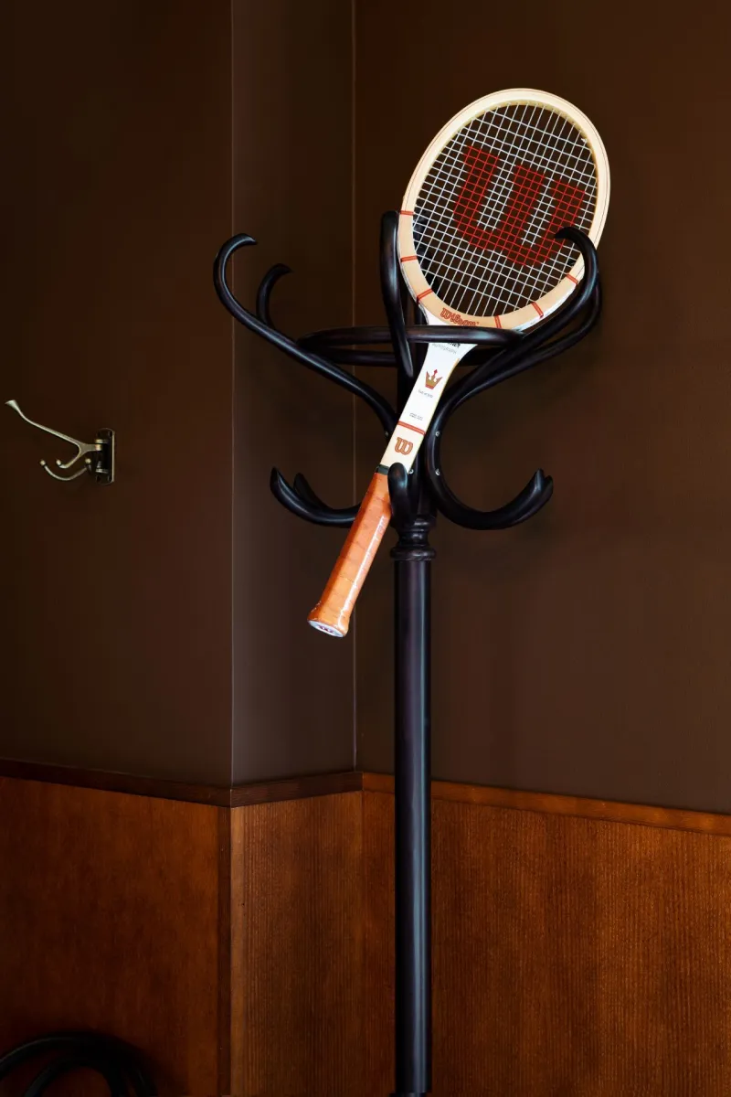
3. Brown is the new black
Brown has never looked better. When aiming for an elegant look to your space, brown is a good choice. Rich and soft brown colours make any space welcoming and comfortable – almost nostalgic.
Brown works with everything but especially with shades of green and blue. Create a space that wraps you up in a warm embrace with Tikkurila Toro Y497 and Wilderness N462. For a more sophisticated look, use our Harmony paint with velvet matt finish.
Location: Restaurant Madonna, Helsinki, Finland
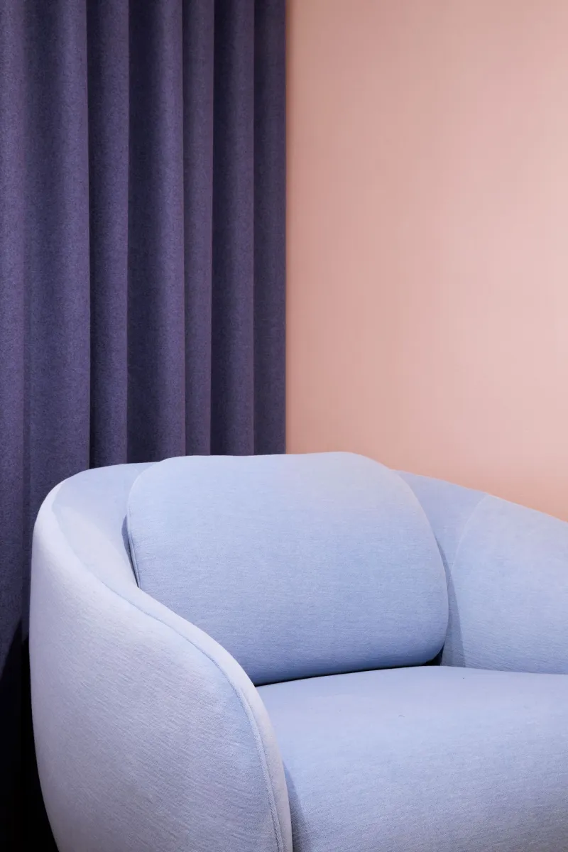
4. Palette of pastels
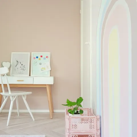
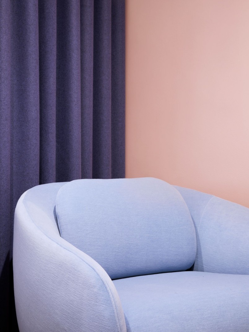
Pair your pastels right. If you are looking to cheer up your space and want to do it with class – pastels are the thing you need. You can pair them with darker, bold colours like dark blue or violet to really make the colours pop.
Surround yourself with powdery dreams using pastels imaginatively. Lilac and baby blue are in demand right now but also pink never gets old. Why not do both? Our favourite shades of pink are Tikkurila Pavillion X417, Pirouette V419 and Salon S478.
Location: Hakola Studio, Helsinki, Finland
5. Yellow lets the sunshine in
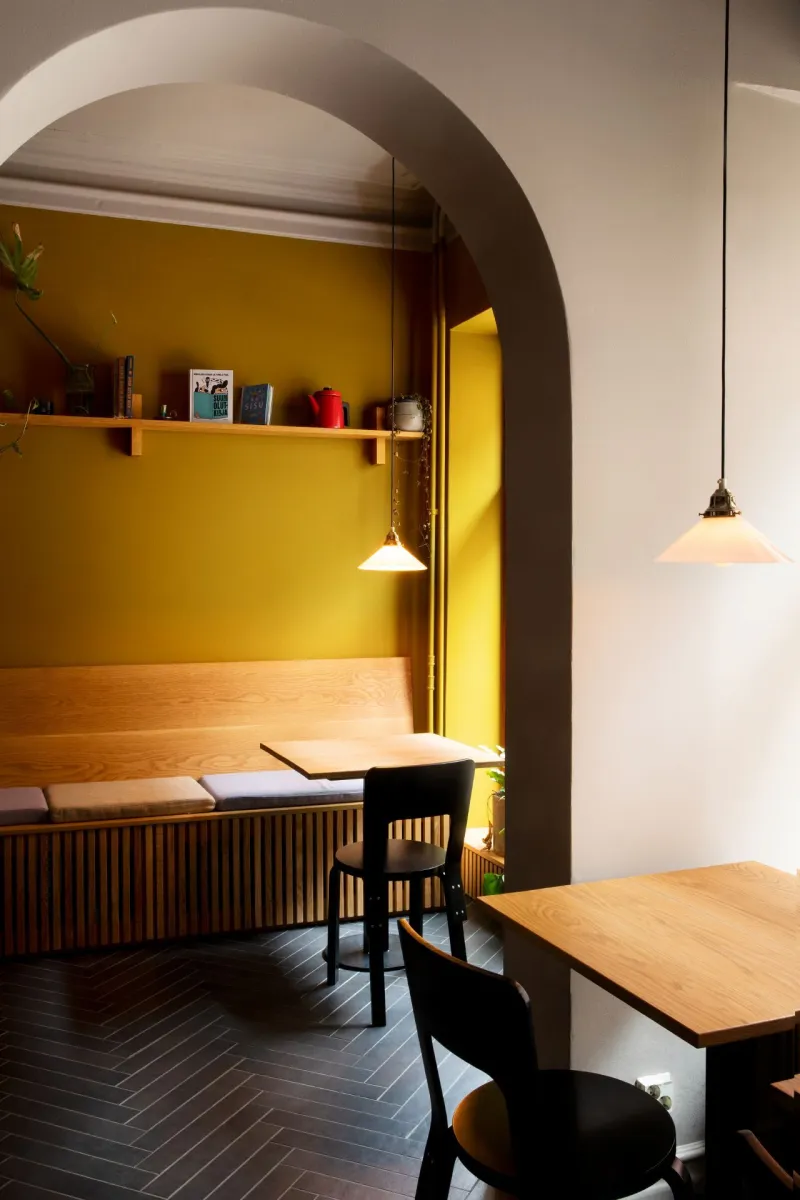
A bright, retro vibe is created with yellow. For a more up to date look, you may want to pair the yellow with more modern interiors and create a contrast with dark details.
Yellow will bring the sunshine into your space even on the gloomiest of days. It sparks your creativity in the best possible way and brings warmth to your surroundings. For a perfect yellow makeover, go for Tikkurila Grapefruit S302 or Wax J392.
Location: Bar Mikkeller, Helsinki, Finland
