A multicoloured designer studio
Plenty Studio is a Finnish design agency focusing on art direction, interiors, styling and set design. When the owners Anna Pirkola and Kirsikka Simberg were about to renovate their new working space and studio, the starting point wasn’t too pretty: white walls that had turned yellow, and a reddish laminated floor – and nothing much else. This, however, presented a wonderful opportunity to create something completely new.
The location is a space of 140 square metres in a hundred-year-old building in Helsinki, with windows facing two opposite directions. It was important for the Plenty Studio designers that the studio would be functional, calm and inspiring.
“We wanted to bring colour to the space, to inspire and to make the atmosphere just right. For once we were designing for ourselves, and didn’t want to take the interior design in our studio too seriously,” Pirkola says.
This article takes a look at the freshly renovated and painted Plenty studio. We hope it inspires you!
Bring in the colours
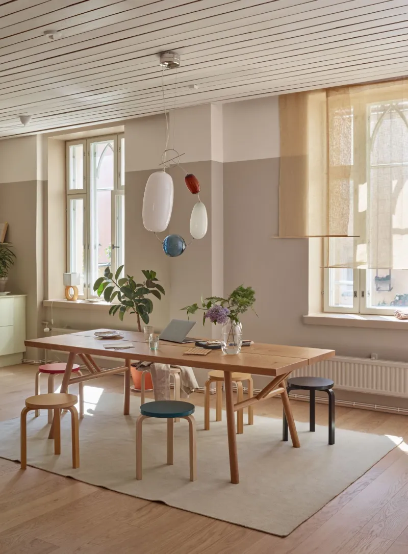
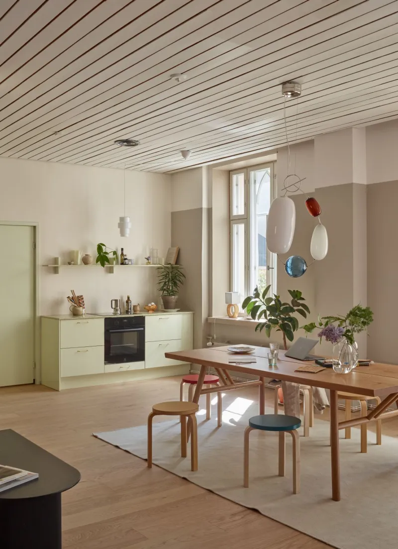
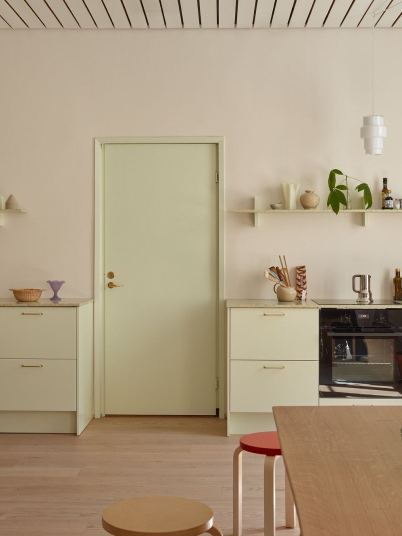
The room combining a kitchen and a lounge area was fitted with new oak parquet flooring. The wall behind the kitchen counter was painted with V484 Driftwood. It was easy to match the kitchen to the space around it, as BLAU Interiors offers kitchens toned in Tikkurila shades. This kitchen displays the luminous Y383 Cucumber shade.
The upper part of the wall next to the counter is painted with F313 Gallery, and the lower part in V466 Lama.
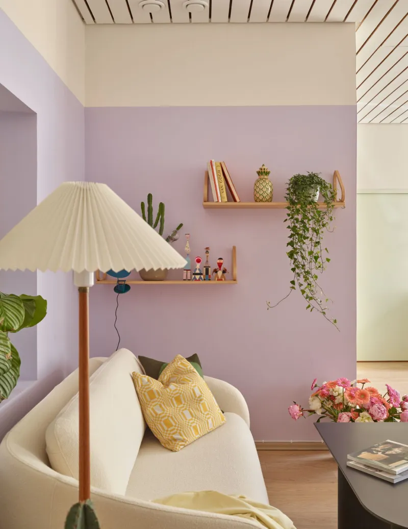
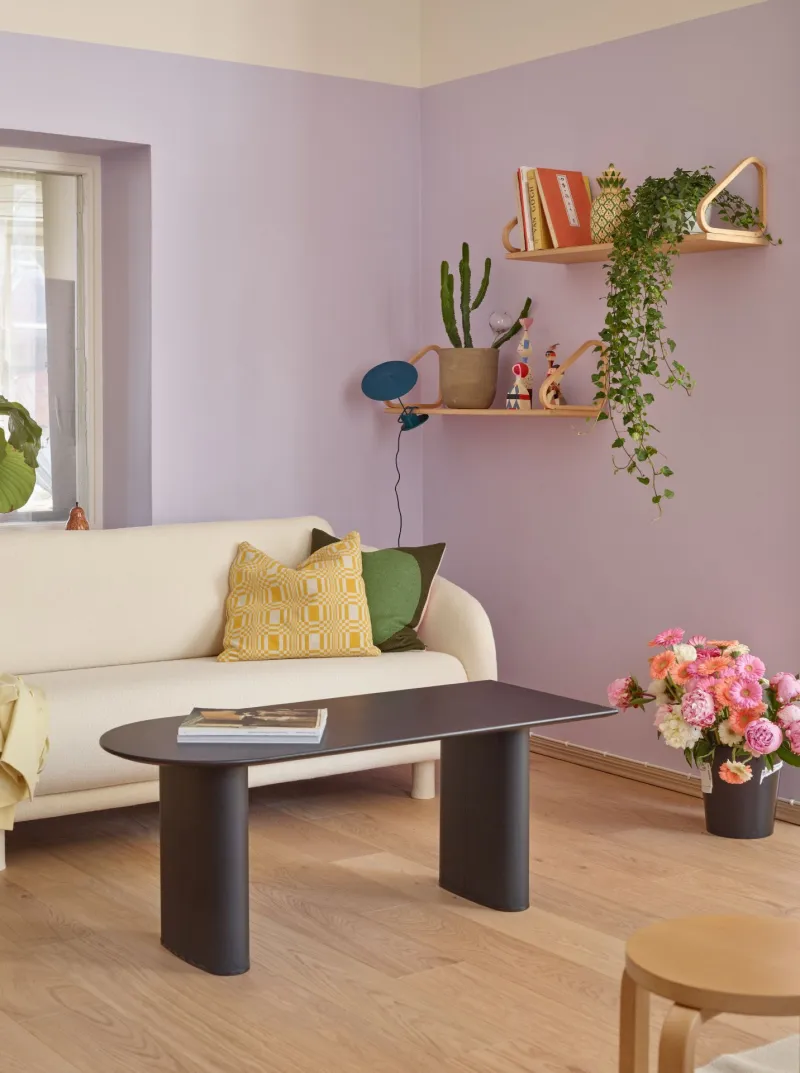
The other side of the room displays the H426 Allure below F313 Gallery shade.
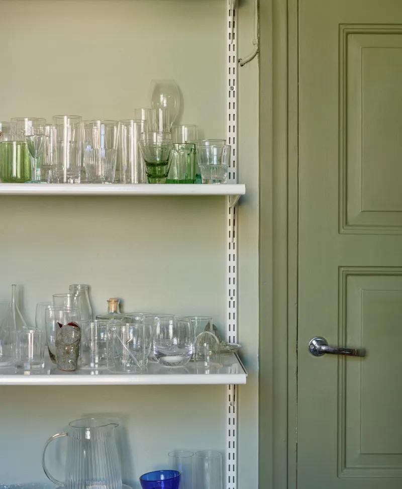
Some of the doors and skirting boards were painted with a darker shade of green, L447 Sepal, which matches deliciously with both light green Y383 Cucumber and H426 Allure on the walls.
“We wanted the entrance to provide a gentle awakening with the refreshing hues,” Pirkola says.
Matching matte and glossy
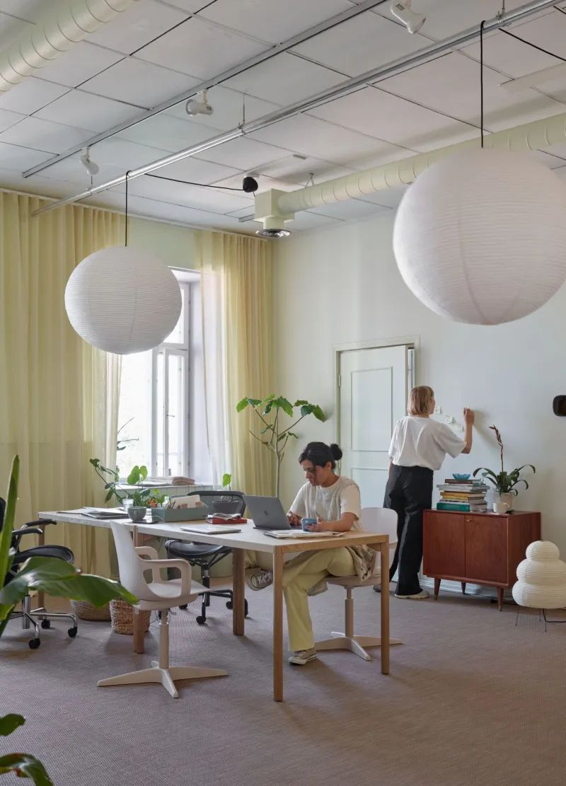
The starting point for designing the main working area was to make the walls light and bright – to offer your mind some free space to wander around. On the other hand, the space required some colour.
“The room is harmonic but not in a completely earthy way – it’s more diverse,” Pirkola says.
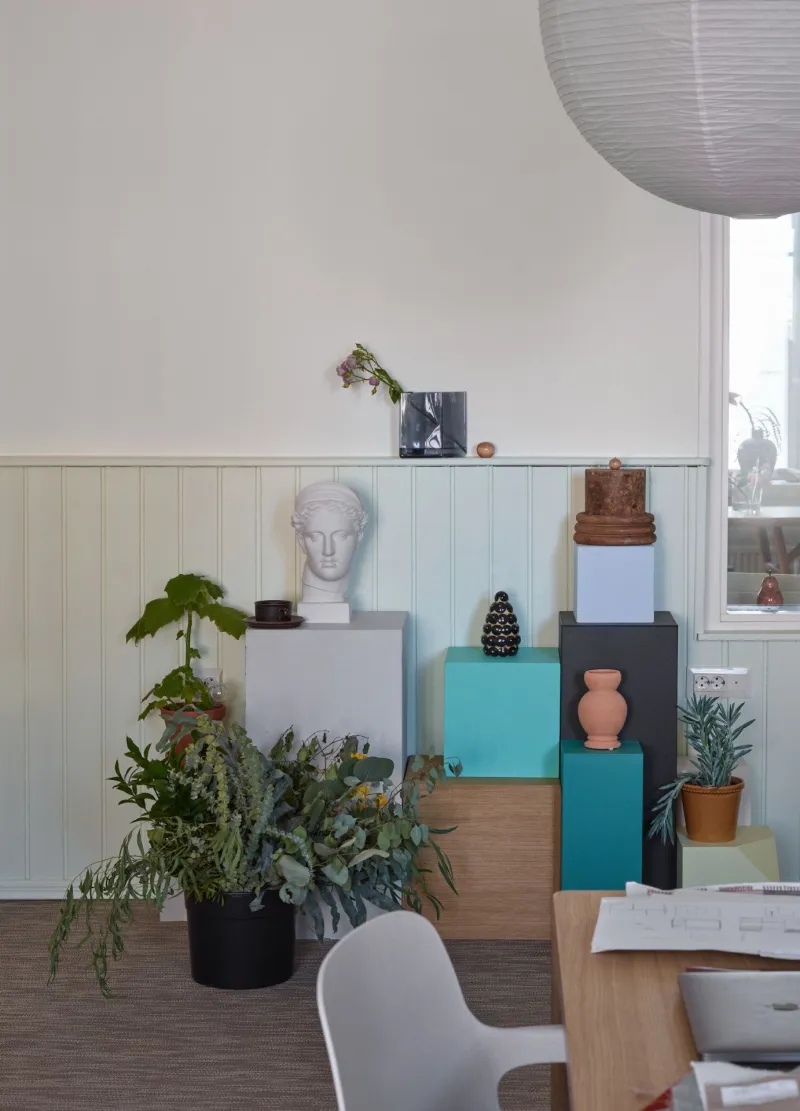
Some of the walls have half panelling, which was painted in light green Y383 Cucumber in a matte finish, as were the doors and skirting boards. Under the windows, there are window benches with Cucumber in a glossy finish.
“Matching matte and glossy finishes makes for an interesting combination and a delightful contrast.”
Details matter
When collecting the moodboard for the new studio, both Pirkola and her companion Kirsikka Simberg had small red dots here and there.
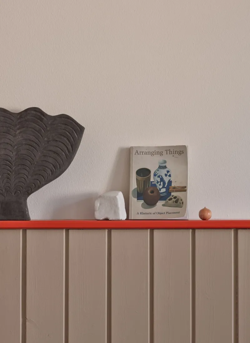
“We decided to bring in some red to awaken and inspire. Colours don’t always need to be used on big wall surfaces, sometimes they work best when used in details,” Pirkola says.
That is why the centre of attention in the meeting room is the slat on top of the panelling, which was painted in the bright red M316 Tomato shade. The half panelling is painted with V466 Lama, whereas the upper part of the wall has the shade F313 Gallery.
