The Color Now collection through visualists’ eyes

Colours can remind us of the people we hold dear, the important events of our lives, and our hopes and dreams for the future. The Color Now 2022 collection will bring those feelings alive on your walls. We discussed the collection with visualists from different lines of expertise. How do they feel about the collection and what kinds of thoughts and memories do the colours evoke?

For the last ten years, photographer Krista Keltanen has focused on shooting home and interior design, harmonising colours to get the perfect picture. You can follow her on Instagram @kristakeltanen or visit her website kristakeltanen.fi.
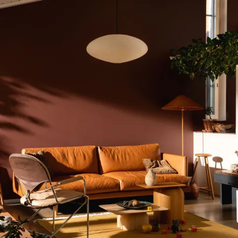
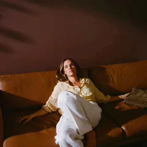
“I absolutely love the Color Now 2022 collection! It reminds me of Finnish swamplands, where it’s possible to find all the colours of the collection at a glance. I immediately entered the same mindspace I have when taking my morning walk or photographing nature, which I love to do. My favourite colour is X447 Sea Smoke, which I would use on our dining room walls. We have a tile stove in a similar colour as L478 Kestrel, and I think the colours would work together nicely, as they do in the collection. Also, I need to paint a cupboard we have and I’m intrigued to use X499 Licorice for that.”
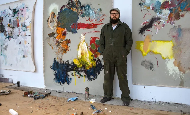
Roy Aurinko is a painter and a visual artist. In interior design, he prefers neutral tones, but in his abstract and expressive art, he plays with colours – his most important tools. You can find Roy’s work on his website royaurinko.com or Instagram @royaurinko.
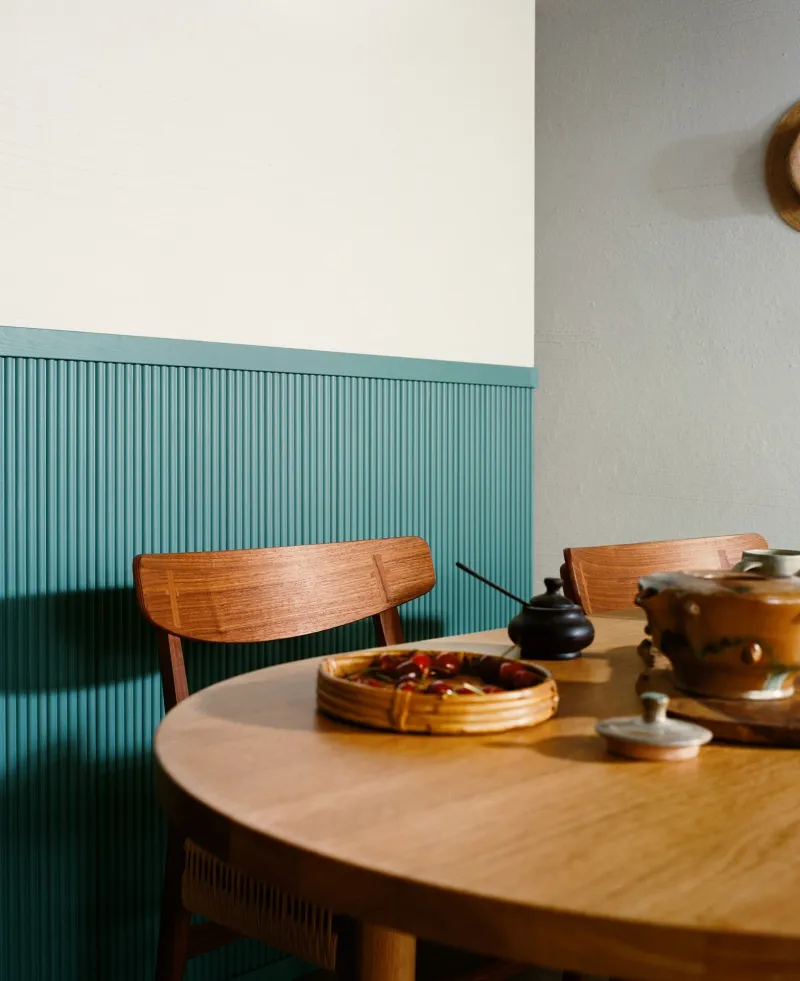
“Colours are the starting point and the end result in my work. When seeing the Color Now 2022 collection, I was surprised to find similar colours I have in my palette right now. That made the colours feel familiar. In interiors, I would use X447 Sea Smoke to paint our bedroom, as we have considered the colour together with my spouse for highlighting one of the walls. Also L478 Kestrel caught my eye. It took me back to the 70s and my childhood home. My mom used brown shades on our walls and I can still remember the smell of that specific paint.”
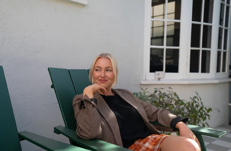
Peeta Peltola is an entrepreneur, editor-in-chief of Bo Living magazine and a creative advisor. She’s enthusiastic about fashion and interior design: in her view, what fashion does first, interior will follow. You can follow Peeta on Instagram @peetapeltola.
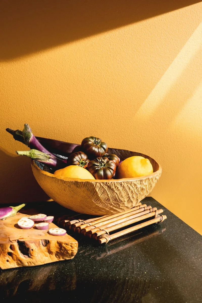
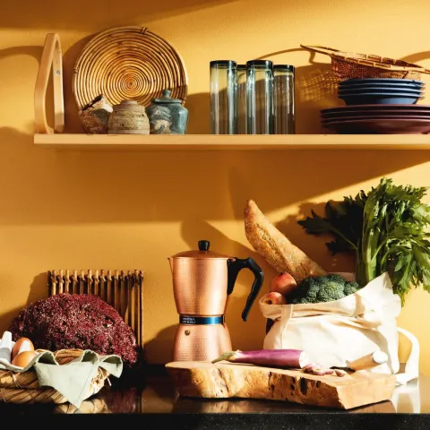
“I feel it’s easier to play with colours in my work. In my own home environment, I prefer neutral colours such as beige and brown. I always consider major changes at length, for instance for ecological reasons, even though I would like to add some more colour to my home. K396 Safari from the Color Now 2022 collection brought up memories from my childhood home, where we had yellow walls. However, my favourite is the Color of the Year, L478 Kestrel. It feels warm, homy and comfy ー like a hug. That’s why I would use it in the bedroom or the hallway. For smaller details, like doors or skirting boards, I would use S440 Silk Road. The bright colour makes the details stand out.”