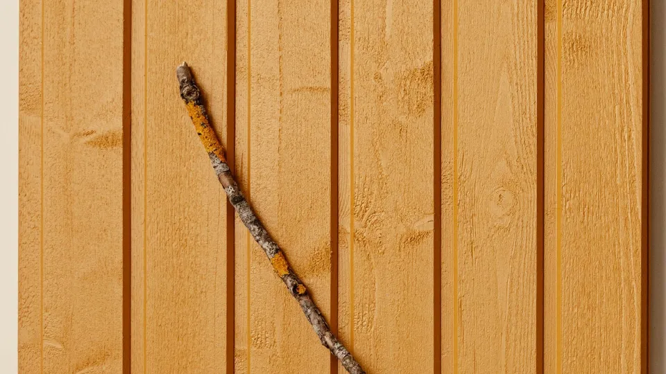
6 most popular colour for wooden facade
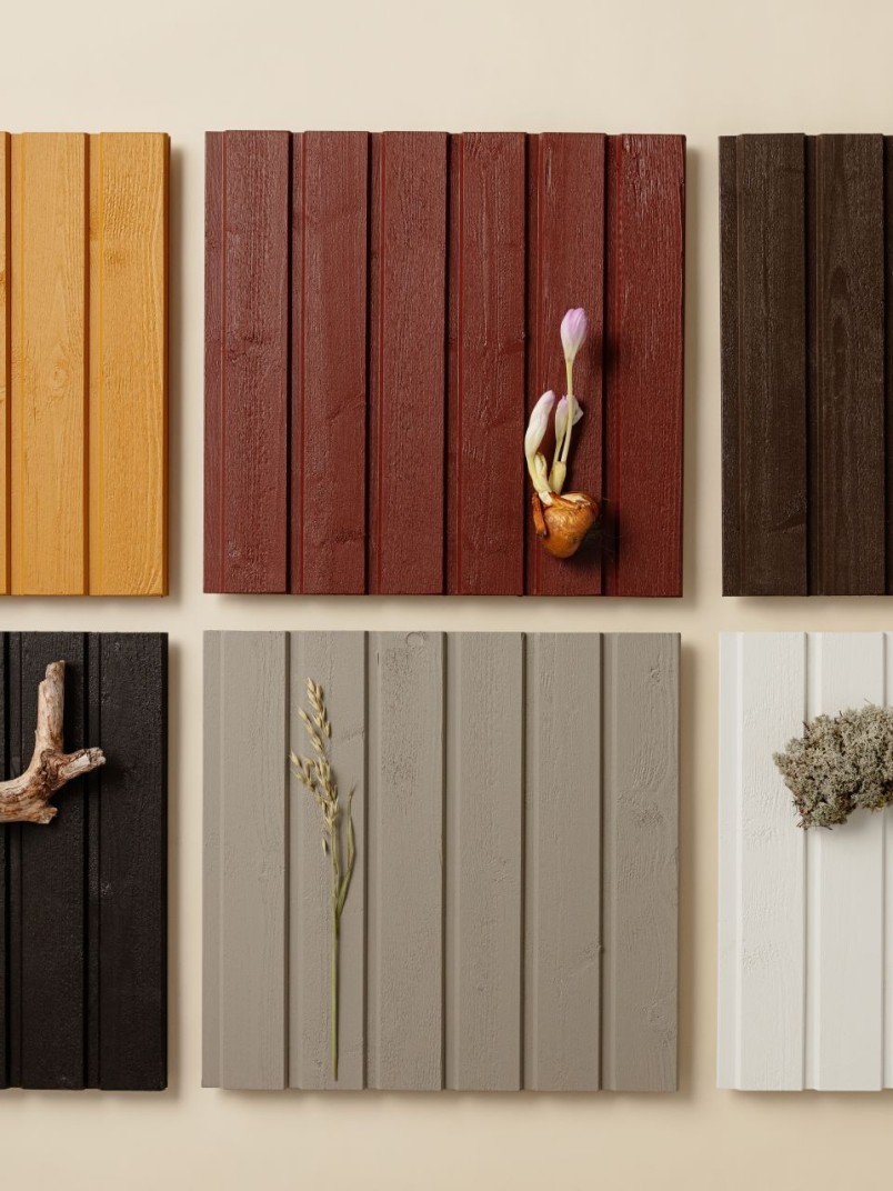
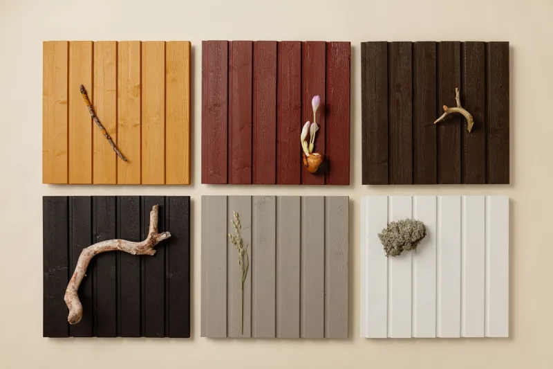
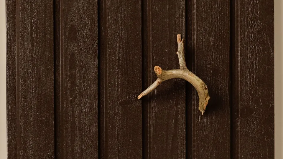
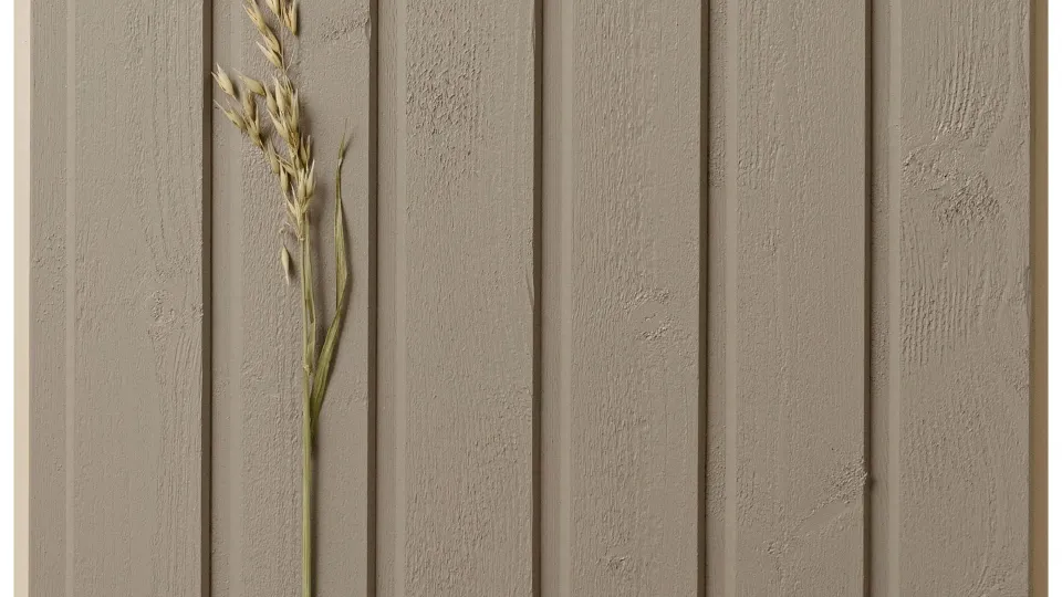
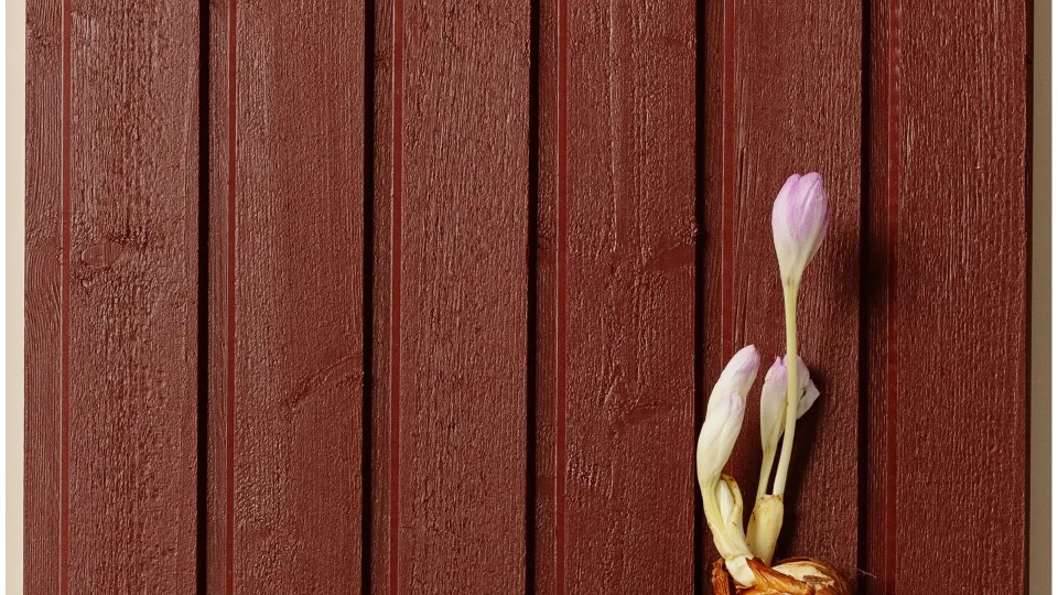
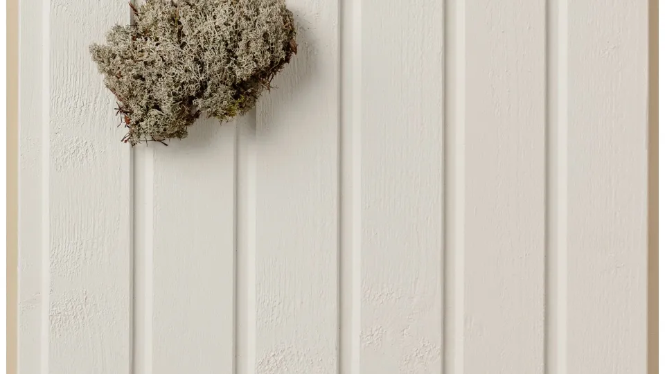
We present six Scandinavian popular opaque colours for wooden house facades.
Choosing a colour for your facade is a decision that requires reflection and background work. We help by offering six classic options from our Wooden Houses colour card with 100 facade colours.
These classic shades make colour selection easier, whether you’re looking for a new wall colour or a colour palette for all surfaces in the building.
In the shades of our Wooden Houses colour card, you can find both modern and traditional options for the facade colours of wooden houses.
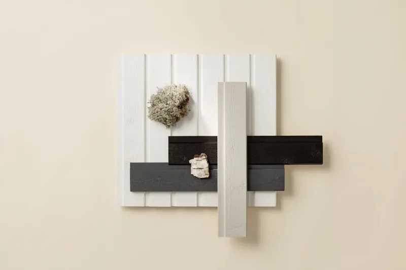
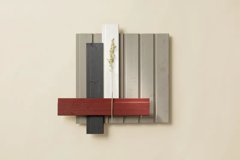
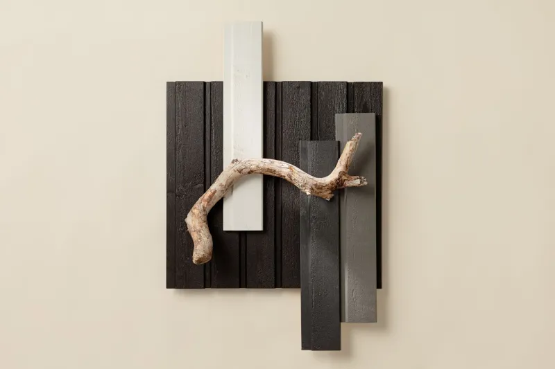
We’ve highlighted these six classics and tell you more about their tones and finished colour combinations.
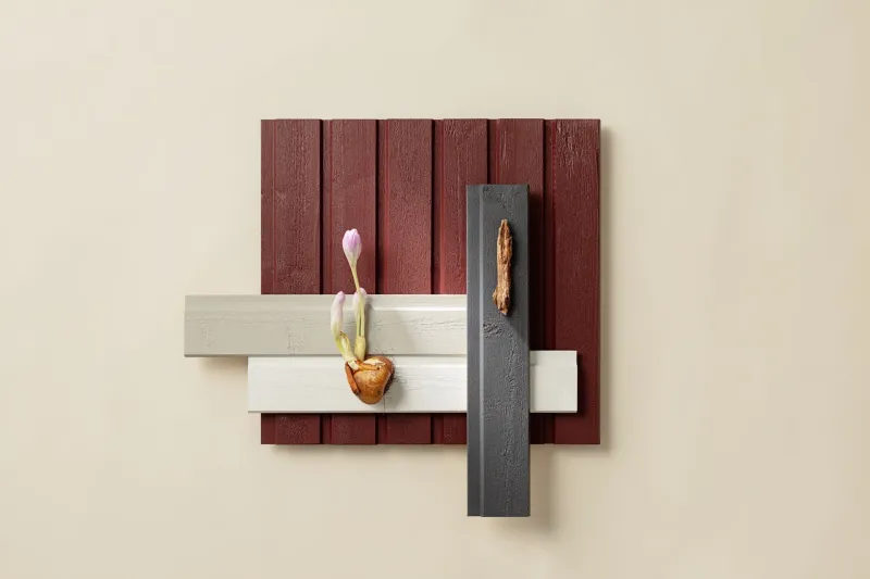
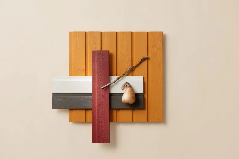
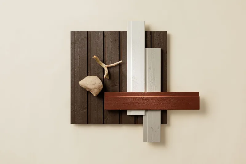
There are as many colour combinations as there are selectors of colours. Sometimes, however, finding the right combination seems to take more time than the painting work itself. We want to help with this and that is why our colour expert has designed six different colour combinations to get the painting work started during favourable painting weather.
Start your colour selection by choosing your favourite wall colour and then check out our tips on what colour combinations can be combined with it.
Remember that when choosing an exterior colour, a successful result will be achieved if you first test-paint the colours on site. Factors that affect colour perception include the amount and direction of light, the surrounding colours and the structure of the surface. The painted areas in relation to each other as well as the viewing distance also affect colour perception. Test-painting and examining the colours on the final surface are the best ways to make sure that the colours will bring joy to their surroundings for a long time.
Looking for useful tips and inspiring ideas for your house exterior projects?
Order Tikkurila newsletter to get professional advice and inspiration for exterior painting season.
