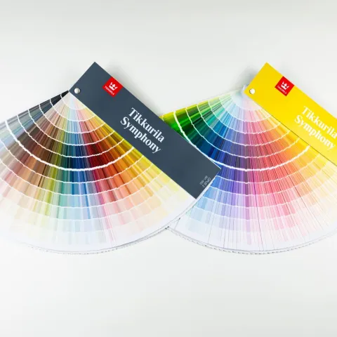
Deeper in White

White is a perennial favourite on both facades and interiors in modern buildings. Interior design blogs even present completely white homes. But what kind of colour is white? Is it even a colour at all?
Harald Arnkil, visual artist, colour researcher and former teacher of art and colour theory at Aalto University School of Arts, Design and Architecture, provides us with clarity when it comes to many aspects of white.

Is white a colour?
White is a colour – as are black and grey – but in colour research terms, it is not a chromatic colour, meaning that it has no hue. Nevertheless, in terms of perception, achromatic colours elicit neurological responses like other colours. In scientific terms, the perception of white results from the eye’s response to light of all wavelengths being more or less evenly reflected and scattered by a surface.
On the brightness scale, black and white are opposites as they have the maximum difference. Visually, the opposite of white could also be a very dark chromatic colour like a deep purple because the contrast in such a combination is very high in both lightness and saturation.
White works well as a neutral backdrop. We often understand white as a blank canvas to which we can add contrasting colours. On the other hand, white text on a coloured background is an effective eye-catcher.
Snow is one of the whitest naturally occurring substances, reflecting up to 90% of the light falling on it. Barium sulphate, which was recently used to create an ultra-white paint, reflects about 98% of incident light. Barium sulphate occurs in nature as the crystalline mineral baryte.
Pure white and other shades of white
Since about the 1920s, titanium dioxide has been used to make white paint. It is a non-toxic, very useful substance that is also effectively opaque. Zinc oxide makes slightly less opaque paint than titanium dioxide. In the past, a common pigment was anti-mould lead white, which was banned due to its toxicity. The oldest white pigments were lime and chalk, and they are still in use.
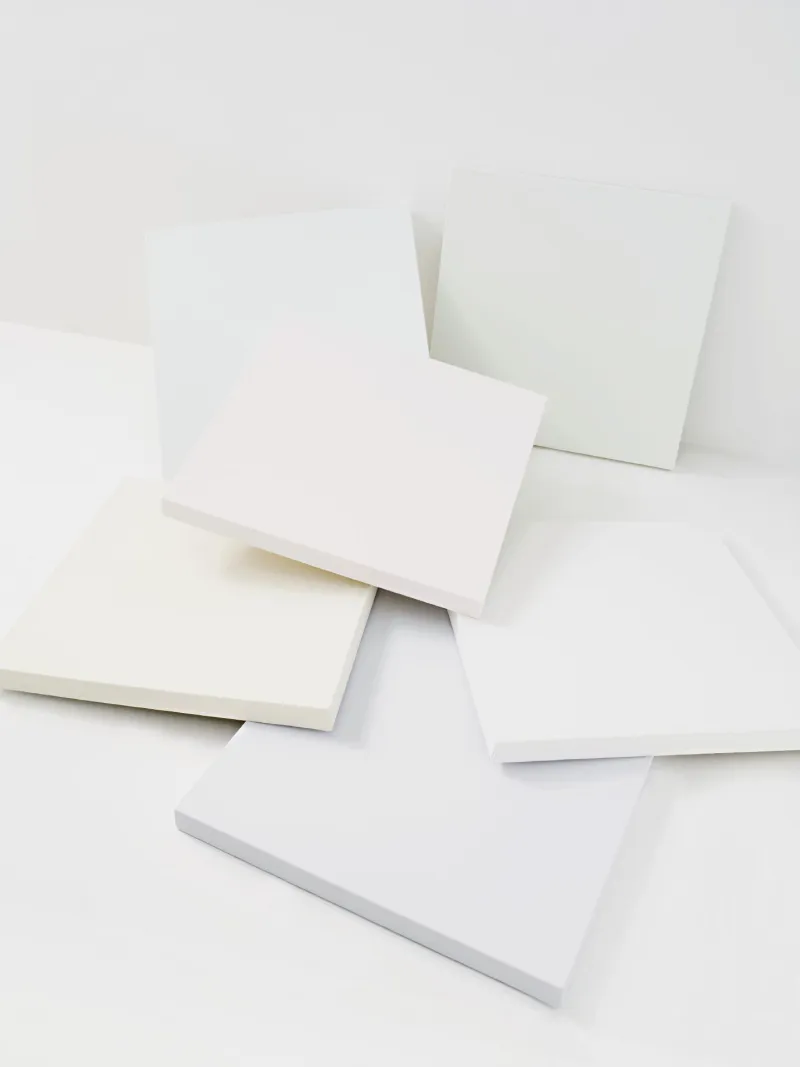
White is usually tinted to a variety of tones and shades, which are generally understood to be white. White is rarely used in a pure, un-tinted form. Compared to pure white, the differences in shades are easy to detect when viewed next to each other. Nevertheless, in everyday life we perceive both greyish pale tones as well as light creamy colours as just white. Due to simultaneous contrast, shades close to white often appear white when the surrounding colours are more intense.
This raises the question, when does tinted white become beige or grey? Clear cut-off values are difficult to define because the perceived colour always depends on the surrounding colours and the illumination.
A practical and popular choice is Tikkurila’s “Painter’s White”, which is the manufacturer’s basic white toned with a drop of black and ochre colorants. This formula reduces the paint’s brightness and increases its opacity. Therefore, Painter’s White hides the surface underneath more effectively and is more forgiving of imperfections.
The etymology and symbolism of white
The word white is Middle English and originates from the Old English word ‘hwit’. The word is related to similar words for white in other Germanic languages and can be derived from the proto-Indo-European root word ‘kweid’; shines; shiny; white. The word wheat also stems from white.
Philosopher Jean Campbell Cooper listed many symbolic meanings of white in her book An Illustrated Encyclopedia of Traditional Symbols, finding it associated with “undifferentiated, transcended perfection, simplicity, light, sun, air, illumination, purity, innocence, justice, holiness, sacredness, redemption and spiritual authority”.
White can hold contrary meanings though. For instance, white is associated with life and love but also with death and burial. White is a colour for expressing grief and sadness in many Eastern cultures and was used that way in ancient Greece and Rome, too.
The purity of white is not only symbolic as some white pigments have also had a hygienic function; lead and lime paints have been used to reduce toxins and mould growth.

White in the built environment
White plays an active role in the visual arts and everyday design. Regarding the built environment, the aesthetic impression of a building will depend on its surroundings. In an otherwise light environment, a white building will merge into the background, but in the middle of dark woods or brick buildings it will stand out. White also provides calm in otherwise multi-coloured spaces.
The structure of the surface to be painted also affects the perceived colour. A course surface can make a white surface appear darker when light rakes the surface obliquely. This is due to the small shadows created by the surface’s structure. The contrast of light and shadow is strongest in white and very pale colours.
On a white surface dirt is easily visible, and therefore it is important to choose the right kind of paint for the conditions. For example, modern acrylic paints are very durable and suitable for surfaces that need frequent washing. In contrast, limewash wears out faster and begins to reveal the colour of the surface, which is not always a negative thing at all.
The functionalist style became popular about a hundred years ago with its lightness of buildings and clean lines. The architects wanted their work to stand out from previous styles. The ideology of functionalism was to create environments that were healthy in every way, which was accomplished not only with practical solutions but also with the aesthetics of purity and healthiness. Hence, white was commonly used for the facades of building.
There are also some misunderstandings about the use of white. In old black-and-white photographs, all light colours may appear white. As a result, later generations have a false picture of the whiteness of the functionalist era. White played a major role, but the era included the skilful use of other colours as well.
An even a bigger mistake concerns antiquity; the modern image of ancient white buildings is incorrect. In fact, the buildings and statues were very colourful but over the centuries, the colours faded and when the statues were later copied, they were presumed to be white.
Literature for further learning
Harald Arnkil, 2013: Colours in the Visual World. Aalto University.
J.C Cooper, 1978: An Illustrated Encyclopedia of Traditional Symbols. Thames & Hudson.
Seija Karttula, 2002: English Colour Terms: Etymology, Chronology, and Relative Basicness. Mémoires de la Société Néophilologique de Helsinki.
Want to learn more and get access to exclusive information?
Feed your creativity with latest trends and grow your know-how about surface treatment solutions. Join Tikkurila Pro Designer - a new arena for creative minds in architecture and interior design.