F497 Paper
Learn to distinguish different whites and help your customer make the right choice.

White is a timeless and popular paint choice regardless of the project. Choosing the right white is not always easy, however, due to the many factors that impact the end result. These include light and optics, undertones, surface materials and product features, among other things. Here are a few points to help make an educated choice.

In terms of light and optics, and to put it very simply, the white “colour” is the result of our eyes mixing the wavelengths of light. A white surface reflects and scatters all the visible wavelengths. Designers measure the light reflected from a surface when illuminated by Light Reflectance Value (LRV) reported on paint chips or paint samples.
Since about the 1920s, titanium dioxide has been used to make white paint. There are hundreds of different whites in paint manufacturers’ selections, and what we see as pure white or off-white mostly depends on what we compare it with in the same environment. On the markets that use automated tinting systems, the purest white is the manufacturer’s basic product without any tinting, and any other mix is off-white. However, the type of paint also affects the shade of white because no ingredient is colourless or transparent.

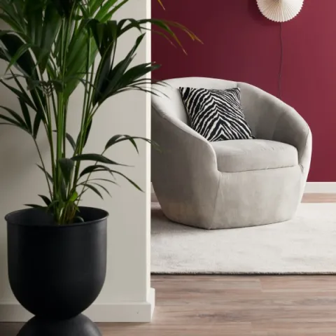
The most popular colour choice of professional painters is usually “Painter’s white” (G497 Tikkurila Symphony) [Replace with local code for Painter’s white if necessary] which is the manufacturer’s basic white toned with a drop of black and ochre pigment. This formula reduces the paint’s brightness and increases its opacity i.e. the amount of light that can pass through the coating. Therefore, the painter’s white hides the surface underneath more effectively and is more forgiving regarding imperfections. Although painter’s white is a classic, practical alternative, it is a good idea to test a few different tones on the surface. For example, a slightly purer white called “Paper” (F497 Tikkurila Symphony) [Replace with local code for Paper if necessary] is becoming more and more popular and may well develop into a new classic.

Dividing colours into warm and cold tones is a tradition that originates from the fine arts and different colour theories.
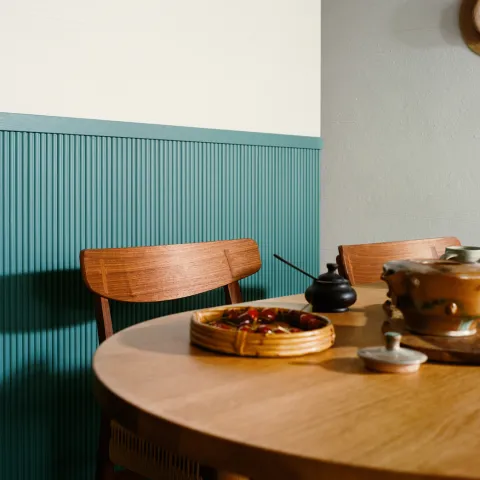
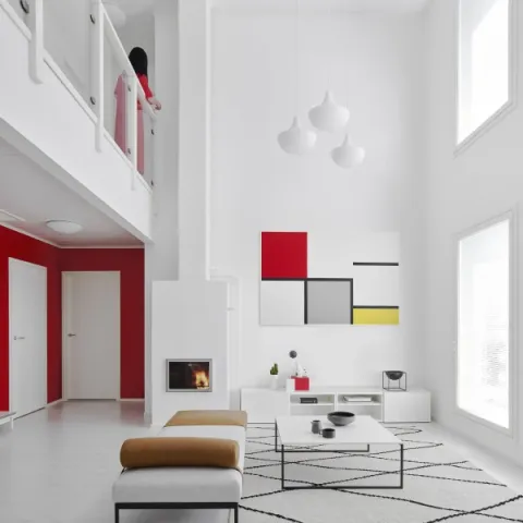
Warm white paint colours have undertones of red, orange and yellow, and cooler whites have hints of green, blue or purple. These categorisations vary depending on the purpose and discipline, and many parallel systems to organize colours exist. Cool whites are often suggested for south-facing rooms, as natural light is inherently warm in tone, but the decision should always be done based on the atmosphere wished – natural light can also be rather blue and cold. Cool whites also work well, if the rooms furnishings have a cool hue, blue or green, for example. Warm whites tend to work well in spaces with poor daylight. They also compliment natural, organic materials, such as wood. Natural light entering the space and the lighting solutions in use greatly impact the shade of white observed. The best practice is to test patches of a few different whites in the room in daylight as well as using artificial lighting.
The paint’s gloss level does not impact whites as much as it affects darker colours. If the surface is very reflective, it may appear brighter but the intensity of white does not increase. Glossy bright “pure” whites usually suit a modern streamlined interior while any more traditional room will feel more attractive and comfortable painted with a matt, off-white tone. The trend for the last ten years has been to choose a semi or completely matt soft, ochre-toned white. Scandinavians tend to favor colder whites compared to the creamier preference of Central Europe. The selection available on the market also steers consumers’ choices.
| Lighting | Furnishings/decor | Gloss level / style | |
Pure/bright whites (F497 Paper) | Artificial light / daylight | Warm and cool tones | Modern, glossy |
Warm whites | Artificial light / daylight | Warm tones (red, yellow, orange, brown), natural materials | Traditional, creamy, semi or full matt |
Cool whites | Lots of daylight | Cool tones (blue, green, purple) | Modern, Scandinavian, matt / glossy |
* replace with local colour codes if necessary


Combining fillers, primers and topcoats may seem pretty basic, but with advances in technology, there are more choices than ever.
Read more
Everything you need to know about water-borne and solvent-borne paints.
Read more
Good pictures and a few kind words from a happy customer will go a long way. Make the most out of your successful projects with outstanding reference cases.
Read moreYou’re visiting Tikkurila website from United Kingdom. Would you like to visit the local UK site?