What designers should know about colours in the built environment?

Colours are essential when designing the built environment and architecture. But what should a designer take into account about the surrounding colours and the colours in the built environment? When a designer has a thorough understanding of colours, the visual rules can be applied creatively.
The expert information in this article is from Harald Arnkil, visual artist, colour researcher and former teacher of art and colour theory at Aalto University School of Arts, Design and Architecture.
Colours are everywhere in the built environment. The Colour – in plain everyday language – typically means the colour of an object, the word that refers to the colour that is perceived as belonging to the object. Although colours have a physical cause, the phenomenon that we perceive as colour is the result of the interaction of object, light and the observer.
Read more about colours and our individual colour vision, is an object’s colour an illusion, and how human perception of colour has evolved through time in our article Where do colours come from.
Rules of colours: Colourant and perception
There are certain established rules in colour design that a designer should know, yet they are only the starting points for creative design. It is widely understood that high contrasts make a space restless while toned down combinations create a calm atmosphere. On the other hand, a total absence of chromatic colour can be alienating.
When designers have a thorough understanding of visual rules, they can apply them creatively. But a lack of understanding can lead to environments that lack identity and sense of place.
The best way to learn to understand colour is to look at, explore, and experiment with different colour combinations. Reading theories and literature about colour helps, but an in-depth knowledge of colour is only attained through practice.
The most important thing for a designer to understand is that a colourant and the perceived colour are two different things.
Painting a square metre of test area will help a designer to better visualize the end result. However, because of a mechanism called “colour constancy”, the perception is affected by the object's relationship to the surrounding colours. Colour constancy is a mechanism that allows our brain to correct the perception by taking into account the changes in environmental conditions.
And therefore, the test area is not observed in the exact same way as the finished surface. Our observation changes, although the measurable colour remains the same.
Learning colour design: hue, saturation and brightness
Designers need to consider three aspects of colour: hue, saturation and lightness. These terms are used with slight variations in meaning in everyday language, in art and in scientific discussions.
Hue is the chromatic variable of colour and refers to the perceived redness, yellowness, greenness, blueness, etc., of a colour. All colours except the neutral greys, blacks and whites have a hue.
The wavelength profile, reflectance and luminance of an area can be established in very precise spectrophotometric terms, but they are not exactly the same thing as hue, lightness, brightness and saturation. Lightness is the perceived reflectance of an object, or a visual estimate of how much light an area is able to reflect irrespective of changes in its illumination. Brightness, on the other hand, refers to the perception of how much light is reflected, transmitted or radiated by an object at any particular moment. A colour’s saturation is its perceived chromatic intensity or vividness.
Colours in the built environment
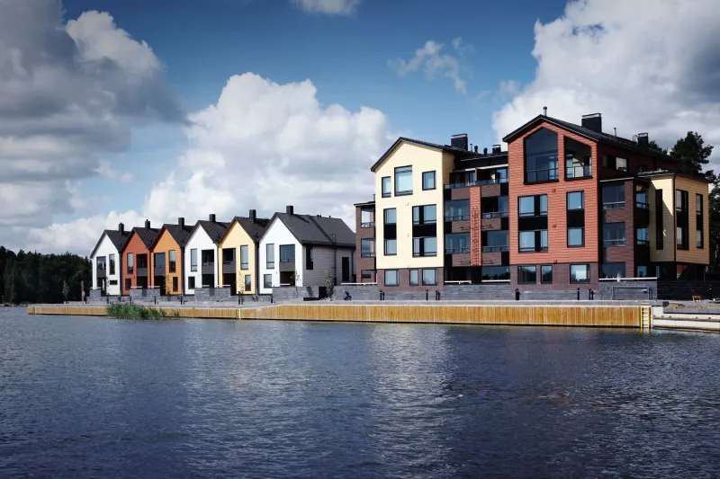
Colours help to integrate and organise building parts, bringing either unity or variety to exteriors and interiors when required. A designer must take into account the surrounding colours and the colour culture of the area. It is also necessary to consider the colour styles of the building eras and the compatibility of the old and the new.
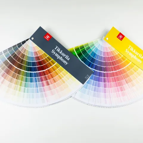
Designs should have a sufficiently precise colour plan. For example, the indication of using ‘light colours’ is too vague. It is better to use exact colour codes than for example generic names of colours.
Interaction of paint and surface
The final appearance of the surface is not formed only by the colour, but also by the composition of the paint and the painted surface. When there is a lot of depth variation, the appearance changes greatly under the influence of light. Especially intense side light brings out the structure.
Modern interiors use mainly matt paints, while for example glossy surfaces were appreciated a hundred years ago. The matte and glossy surface reflect light in different ways: matte diffusely and glossy more mirror-like, directional. The degree of gloss greatly affects how deep or dark the colour is perceived.
Different paints cover surfaces in different ways. Some paints leave the structure of the base surface more clearly visible and some create a whole new structure.
Structural effect coatings create new structure and change the appearance of prescribed colours. Rough structure coatings surface can make colours appear slightly darker than the colour standard because of the pattern of minute shadows cast by the roughness of the surface.
Want to learn more and get access to exclusive information?
Feed your creativity with latest trends and grow your know-how about surface treatment solutions. Join Tikkurila Pro Designer - a new arena for creative minds in architecture and interior design.
