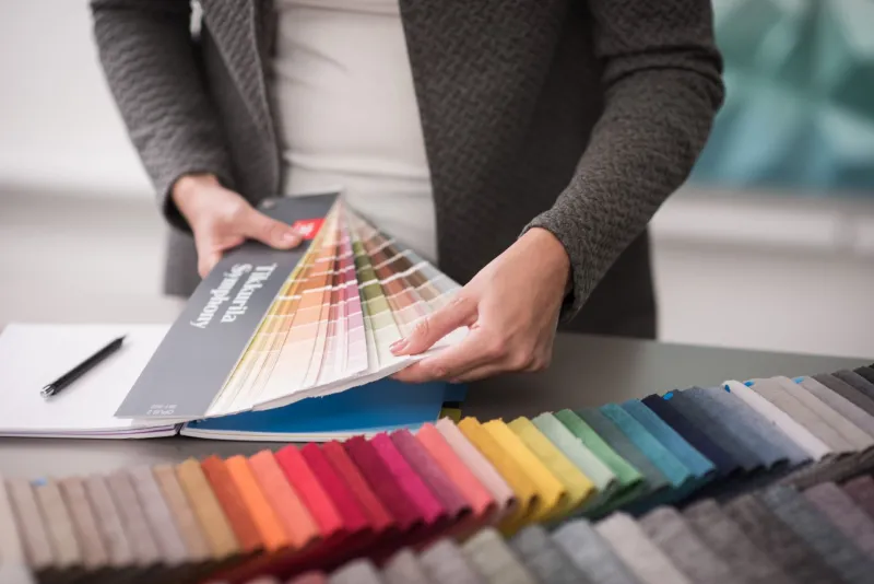
What is Tikkurila Symphony and how to use it?

Tikkurila Symphony is a colour chart comprising 2,436 colours suitable for interior paints. The colours are carefully kept constant in order to provide a reliable end result. When making the best use of Tikkurila Symphony, you can be sure that the colour on the painted object accurately corresponds to the colour design.
Symphony color system, Tikkurila tinting system and all Tikkurila products have been developed to be perfectly compatible. This makes it possible to offer the most reliable tinting result possible and to attain optimal performance of the paint.

Symphony in numbers
- Symphony color system was lauched in 2002.
- It comprises 2,436 individual colours: 203 origin colours, 1,218 lighter hues and 1,015 lighter muted hues.
- Symphony consists of two fan decks, OPUS 1 and OPUS 2.
- OPUS 1 covers bright colours (300–390) and OPUS 2 more muted colours (391–502).
- Symphony extension also offers ten off-white shades (503).
Emphasis on colour perception
Different colour theories, models and systems have existed for centuries, originating from the need to understand the nature of colour and to categorize it in a systematic way.
Tikkurila Symphony color system is based on colour perception. This allows the colour designer to pay full attention to observing the physical colour and its behavior.
In addition to our subjective perception of a colour, other factors such as the physical surroundings and lighting as well as the surface material of the painted object affects how a colour is perceived. Therefore, colour samples should be examined in natural surroundings and, if possible, test painting is highly advisable. For test painting purposes, there are Tikkurila colour testers available in sample size pots.
How to interpret the colour page
For easy use, Tikkurila Symphony colors are presented on two fan decks, OPUS 1 and OPUS 2. OPUS 1 includes clean, bright colours, whereas OPUS 2 consists of earthy, muted tones.
Each page of the two Symphony fan decks consists of 12 colours. Each colour has an individual code consisting of a letter and three numbers. The code indicates where a specific colour is located on the fan deck; it does not provide information about the composition of the colour. All the colours on the same page have the same number code.
In the middle of each page, there is the so-called “origin colour” marked with letter M. Eleven other colours on the page are hues blended from the origin colour. Colours above the origin colour are lighter hues, marked with letters L, K, J, H, G and F. Colours below the origin colour are lighter muted hues with a hint of grey in them; these are marked with letters N, S, V, X and Y.
Note: Colour pages 488–502 make an exception since they are organized in a direct colour value order from the top of the page to the bottom. Also, line 503 has ten off-white hues and appears only in the most recent printed materials.
Access Symphony color system here.
Want to read more about colours and colour materials? Please subscribe to our newsletter for architects and designers and stay up-to-date with our latest news.
