You’re visiting Tikkurila website from United Kingdom. Would you like to visit the local UK site?
Achromatic colours in design
How to use black, white and different shades of grey.

Achromatic colours – featuring all shades of black, white, and grey – form a big part of any designer’s toolkit. Achromatic colours have no saturation or vividness, as they have no dominant hue, either. And while in chromatic colours only one particular wavelength of light dominates, achromatic colours contain all wavelengths of light within them.
For designers subscribing to the Scandinavian Design school, achromatic colours represent a real cornerstone for most design projects. After all, the modern Scandinavian design style emphasizes streamlined, functional simplicity with the use of dashing colour kept moderate if not minimum. This design style is rooted deep in the Nordic design tradition.

Black, white and everything in between
Lightness is a property that exists within both chromatic and achromatic colors – in varying degrees. This means that both chromatic and achromatic color schemes contain light and dark colors.
Black, white and everything in between – that’s also a very commercial recipe. Achromatic colours are best-sellers in most markets, for obvious reasons – most walls and ceilings are white and will remain so in the foreseeable future.
Boosting functionality
Achromatic colors can certainly enhance the functionality of both buildings and their interiors. With use of whites, for example, the feeling of increased space and light is an industry staple that we’ve seen time and again in kitchens and bathrooms, for example. White hues are also associated with cleanness in places like hospitals. In the hands of a skilled designer, however, achromatic colours can go well beyond the obvious benefits and achieve great results.
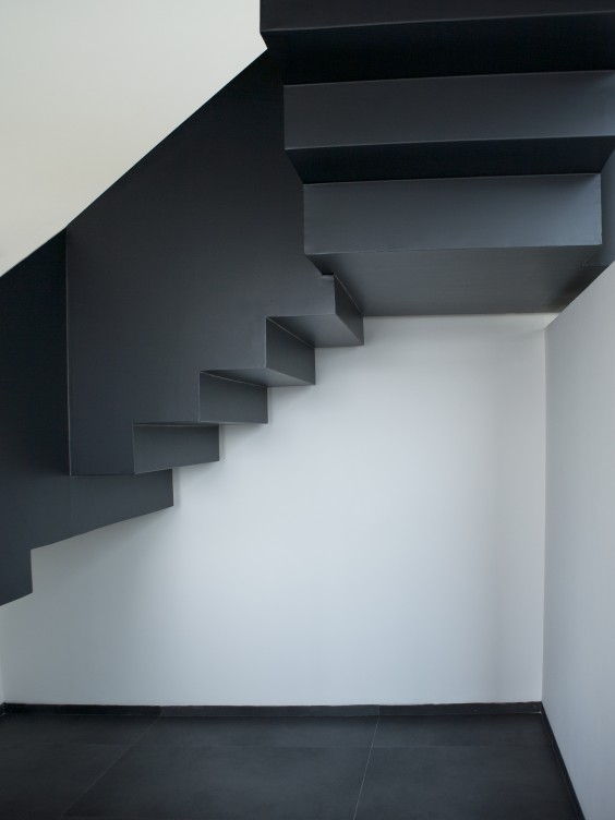
Visually speaking, when you’re dealing with powerful designs in e.g. architecture, use of achromatic colours can really bring out the intended shapes and structures in any given space.

Achromatic colours in transition
One has to recognize, however, that the achromatic colors are not static as such – when we look at the way they are used. Achromatic colours tend to transition – within a period of ten years or so – from colours that are cold, cool and hard to softer, rounder and warmer hues. Depending on the prevailing trends, you can, for instance, expect different whites to get colder or warmer – or appear purer or muted to the eye.
Quest for grey
The true test of the designer is not handling black or white colours, though. Instead, many designers face challenges when they pursue true, neutral grey. This “perfect grey” is surprisingly difficult to achieve. Why is this?
The trouble with grey is that it picks up subtle sub-hues quite easily – due to such factors as environment, colorants or pigments used in paint as well as lighting which can be hard to control. As a result, the grey will stray, so to speak, showing, for example, a bluish hue.

Only with patience and thorough testing can you be sure that you actually get the neutral grey you want. And since the true grey is so difficult to secure, sometimes it makes sense to look into other alternatives (other greys), too.
Black and white can have sub-hue issues, too; with black colour hinting blue or brown and white showing the slightest yellow.
While achromatic colours are frequently in play in almost any design project, it is good to keep in mind that you can always go deeper. Learning about the nuances and the ever-so-subtle differences within the achromatic family is a life-long journey, but also a quite satisfying one.
Mastering the achromatic palette goes a long way towards achieving a smooth, sophisticated design that is futureproof and well-balanced.


