You’re visiting Tikkurila website from United Kingdom. Would you like to visit the local UK site?
How can we use lighting to achieve a balanced colour palette?
Colours and lighting in public facilities
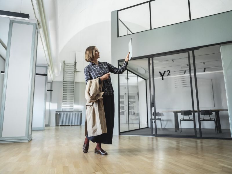
The relationship between light and colour plays an important role in shaping the visual experience of a space. Thoughtful consideration of lighting can impact the perception of colours in different environments. Natural light, artificial lighting sources and colour palettes collectively shape the emotional response of people using the space. What designers should know about colours and lighting? In this article we concentrate on the colour and lighting design of public environments.
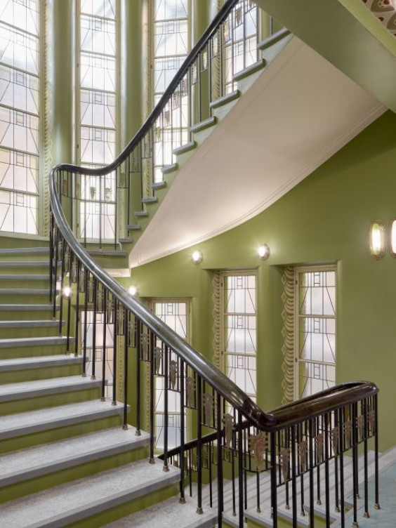
What is the purpose of the space?
When we start to plan the colours of a space, the first obvious questions should be: What kind of space is in question? What functions are intended for that space? After answering these questions, we can support the functions of the space with colour and lighting. Whether creating a cosy ambiance for a dinner setting or ensuring optimal conditions for a surgical operation, the design process should consider the specific functions, atmosphere and mood desired.
The design should also recognise that colour is subordinate to light: perception of colour can be influenced by the quality and quantity of light present in the space. Natural light obviously has an impact on a space, and it should be carefully considered when doing the colour design – how much natural light enters the given space, how does it change during the day and other important factors. Nevertheless, we cannot control so much natural light, but artificial light is something that we can control and even finetune to specific function.
Lighting and the perception of colours
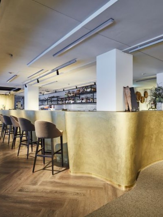
Lighting can significantly affect the perception of colours in a space. The choice of lighting sources, such as general lighting, spotlights or accent lights, can impact the way colours are displayed. For instance, in a clothing store, various light sources may be used to highlight different aspects. General lighting may provide a neutral and pleasant atmosphere corresponding to the overall appearance of the brand, while spotlights can accentuate specific colours, making them
The selection of lighting sources is crucial for creating the desired visual impact, whether it's in a retail setting, showcasing artwork or in a library reading corner. As colour researcher Harald Arnkil writes: “The evenness or unevenness of illumination, the contrast ratio between the space and its surroundings, glare and specular reflectance influence the perception of colour and visual ergonomics.” (Arnkil, Harald: Colours in the visual world, 2013).
The colour temperature also affects the perception of colours. The colour temperature of a light source refers to its warmth or coolness. Light sources with lower colour temperatures (from 2700K to 3000K) tend to enhance warm colours, while higher colour temperatures (4000K and above) may accentuate cooler colours. On the other hand, lower colour temperatures can make cooler tones appear slightly yellowish and dull, and if warm tones are illuminated with cool light, they may not appear as vibrant.

High CRI and quality light sources make the colours accurate
Accurate colour reproduction and sufficient lighting are crucial elements to consider when planning the colour design for a space. Light sources with higher CRI (Colour Rendering Index) values tend to render colours more vividly and accurately, influencing how objects and surroundings are perceived.
When discussing colours being reproduced as accurately as possible, a high CRI light source is naturally preferred – ideally over 90, and in certain cases, even up to 95. For instance, in a restaurant environment, a high CRI ensures that the food looks pleasing in colour and doesn't appear unappetising. Similarly, in a healthcare environment, selected light sources should accurately render the true colour of objects, materials and skin tones.
The type of the artificial light also influences the way we see the colours. Earlier there were various options from incandescent lights to halogen and fluorescent lights. Nowadays, LED lights are the most common type of artificial lighting in use (see e.g. International Energy Agency). Advancements in lighting technology have expanded the possibilities for designers, and LED lighting offers a versatile tool for adjusting colour temperatures, intensity and dynamic lighting effects.
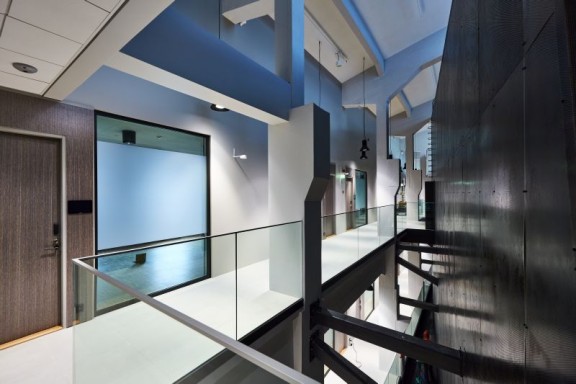
Energy-efficient LEDs and high enough CRI are also something that a designer should pay attention to when thinking about lighting requirements in building standards. Most building standards typically include guidelines and requirements regarding lighting to ensure that buildings are designed and constructed with adequate and energy-efficient lighting systems. Some standards may specify minimum CRI values for lighting systems to ensure that colours are accurately represented. For example, in the WELL standard one point can be earned if the CRI is 90 or more (see WELL vs2, Electric Light Quality).
Coordination of colour and lighting design
Colour and light are dependent on each other, but often colour design and lighting design are two separate factors. To reach the best result it is important to coordinate these two factors and establish seamless collaboration, especially when designing public spaces. Without a solid bridge between colour and lighting design, even the most beautiful colour design may not achieve its potential. And vice versa: the most exceptional lighting design will not work if the colour design does not support it. Designers should always keep in mind that a successful outcome requires effective collaboration between colour and lighting design.
