Bold usage of colours creates a warm and cosy atmosphere – this is how you do it with Color Now 2023 palette
Warm tones, bold colours, and intense spaces. A bold colour palette consisting of Color Now 2023 colours will introduce an entirely new atmosphere to a room.
The Color Now Palette 2023 is bursting with bold colours with ones you can create a uniquely warm and cosy atmosphere. The colour collection is created for going bold, combining unique colours in an unexpected way and using even the most daring colour combinations.
In the collection you will find deep and rich colours, such as the Color of the Year 2023, V413 Rosy Moment, together with earthy brown L478 Kestrel, enigmatic X501 Aubergine and lush green M449 Grotto. Fresh S440 Silk Road, Y406 Riviera, and lively H320 Magnolia light up the collection. Get to know the whole Color Now 2023 collection here.
Whether you want to create a rich, colourful mood or a cosy atmosphere, here are our top tips for utilising the Color Now palette.
Starting from the colour palette
The design starts by choosing the colour palette. A ready-made option is to pick Tikkurila’s Color Now Palette 2023, which works as a moodboard for your interior design.
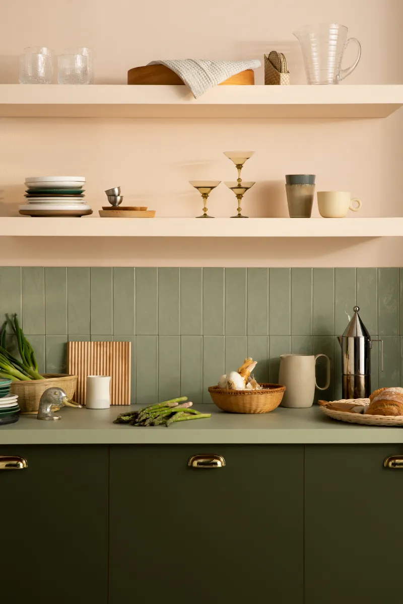
Creating a colour combination for a space often starts by finding opposite colours from the colour wheel, such as mossy green M449 Grotto on the wall and a delicate H320 Magnolia on the ceiling. This will bring balance between the colours in the space and make each colour feel rich. Pinning down the best colour combinations will make the room pop up.
Lighting brings the colours alive
The Colour Now Palette 2023 and its warm tones invite people to stay in each room. They create an intimate and warm atmosphere that feels royal.
The Colour of the Year 2023, V413 Rosy Moment, is a bold colour that can be used on each wall of the room. When using such a bold colour, it is important to pay attention to the lighting, which greatly impacts the end result. The darker you choose the lighting, the more intense the colours will look and the deeper the room’s atmosphere will be.
Push boundaries
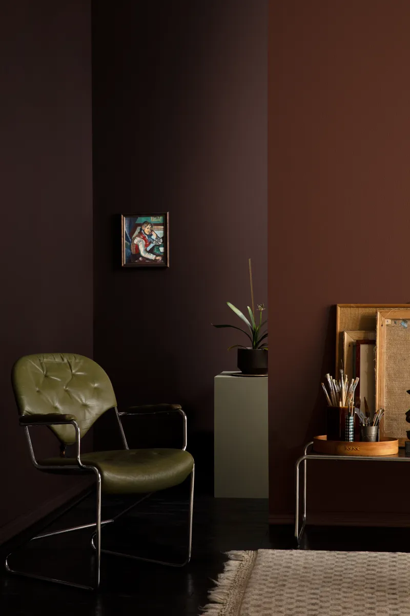
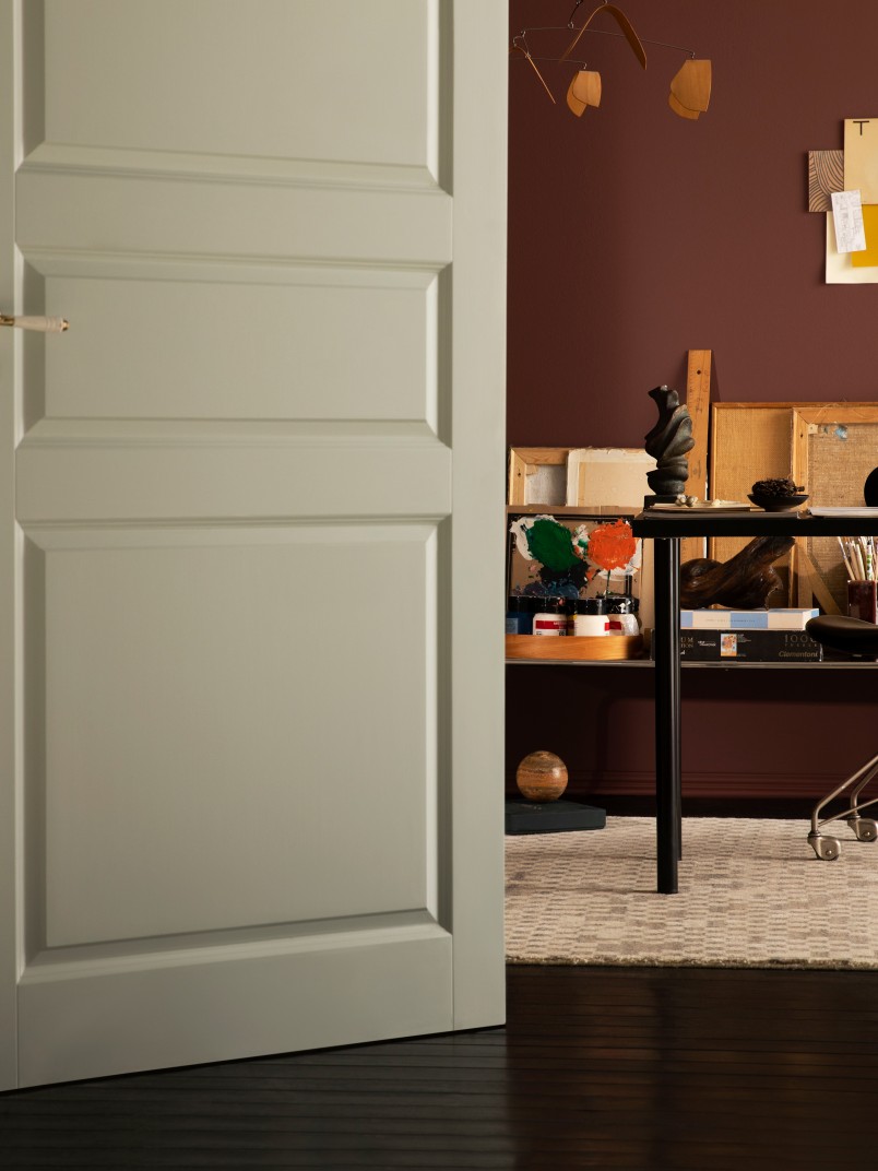
Using only one colour or two might make the room look flat. A slightly broader colour palette allows you to achieve a more intense and dynamic space. However, choosing one primary, and two secondary colours will prevent the room feeling chaotic. Try, for example, creating an energetic room by combining L478 Kestrel with X501 Aubergine and soothing X447 Sea Smoke as in the image. The light grey X447 Sea Smoke in the door highlights the atmosphere of the rest of the room. Also, choosing a white rug brings a slightly lighter atmosphere to the otherwise intense home office.
Playing with perspective in between rooms
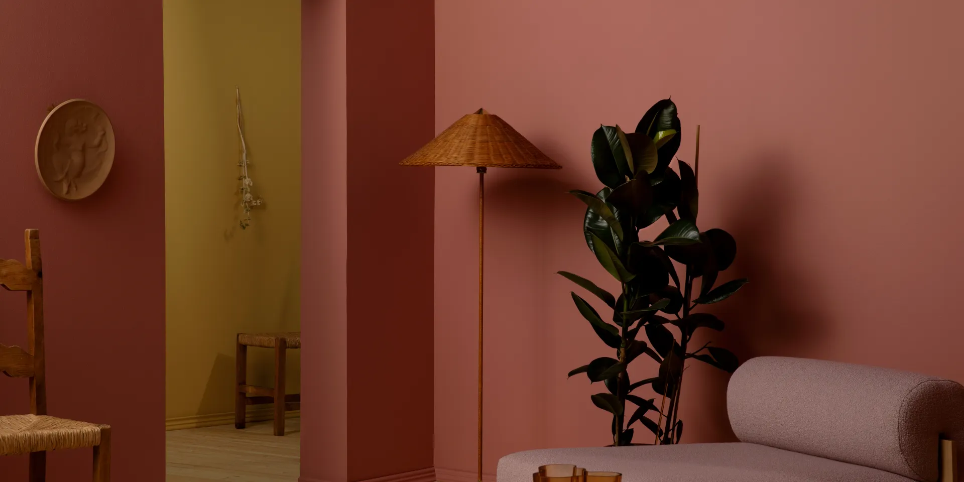
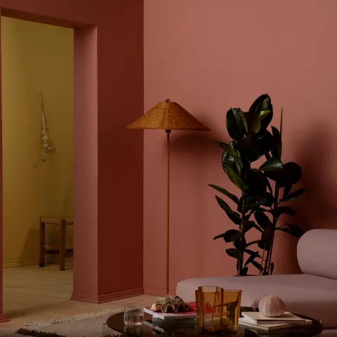
Contrasting colours have an inviting ambience. In the image, the walls are painted with the Color of the year 2023, V413 Rosy Moment. The muted fuchsia colour has J392 Wax as an opposing pair in the next room. The way colours are used in this space brings a touch of dimensions between areas. The atmosphere of the space consists of the dialogue of the adjoining rooms, as colours always have their effect in the room next door as well.
Want to learn more and get access to exclusive information?
Feed your creativity with latest trends and grow your know-how about surface treatment solutions. Join Tikkurila Pro Designer - a new arena for creative minds in architecture and interior design.
