Colour therapy and relaxation in Vytautas Ego Spa Hotel

Vytautas Ego SPA, a hotel and spa complex in Birštonas, Lithuania, provides relaxation and wellness services, including colour therapy, for its adult guests. The building’s bold and bright interiors and striking architectural features are unparalleled in the country.
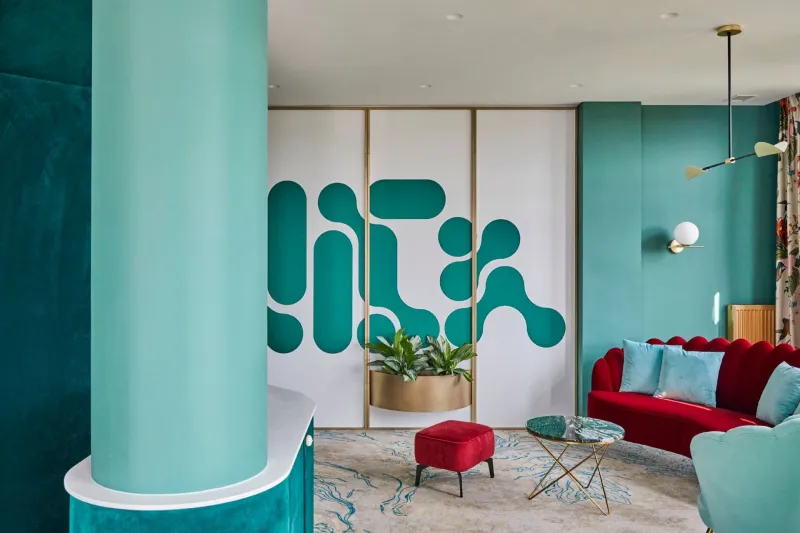
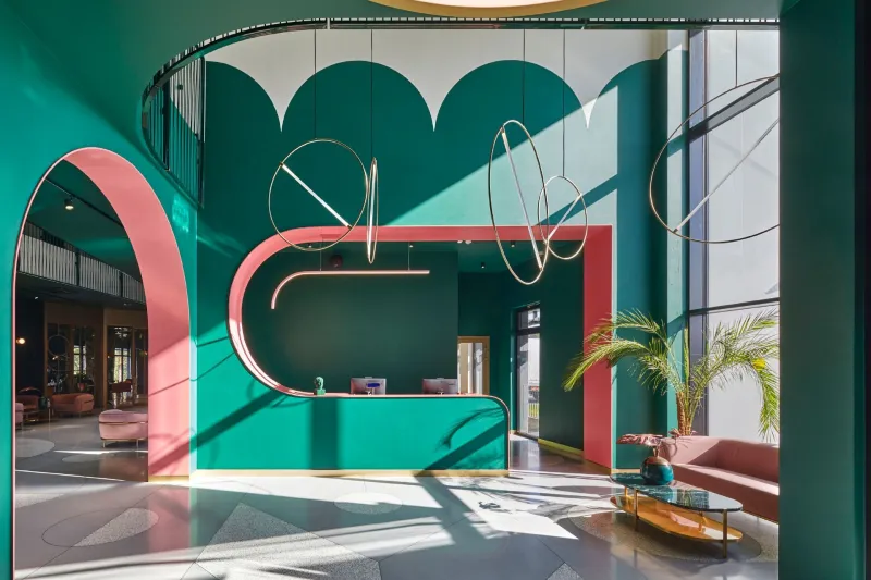
At first approach, the hotel building attracts the eye with its unusual oval shape and light façade. The decorative plaster chosen for the façade of the building and the openwork of metal cables hide the "green" idea – the façade will be planted so that greenery covers the wall. Upon entering the main lobby, guests are welcomed by incredible narrow oval-shaped openings with galleries that open out into 59 guest rooms, all with unconventional shapes and layouts. Skylights covering the whole length of the atrium offer views of blue skies above, blending with the rich colours of the interior.
According to the architect, the customer set certain requirements for the building: there had to be an appropriate number of rooms, areas for relaxation and wellness services, a restaurant and a large conference hall. In addition, the restaurant kitchens should ideally be spacious with a separate pastry area.

Dramatic emerald tones bring a rich warmth
The hotel's interior is dominated by the colour emerald, which reflects the green of the surrounding pines. The bright, contrasting interior was created by interior architect Viktorija Puodžiūtė and her team. In the interior, the prevailing Art Deco lines of the early 20th century intertwine with motifs characteristic of the postmodern Memphis Group.
“When we first discussed our ideas for the interior with the customer we agreed both seriously and jokingly that people must feel like they are in paradise. We analysed the old ideas of the Memphis Group and Art Deco styles that are reborn in various forms in global trends. This is how the first ideas were born little by little – lots of colours, shapes and playful geometry. There were no specific requirements when creating the interior, so we were given a lot of freedom for our ideas,” says Puodžiūtė.

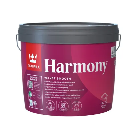
Paints that visually smooth the surface
A soft and gentle yet dramatic atmosphere has been created for guests throughout the hotel. In the corridors and rooms, guests’ feet sink into soft carpeting and the walls are richly painted in warm colours, covered with opulent velvet or soft panels, or decorated with impressive drawings.
The rich, green colour scheme of the hotel restaurant was created with the acrylic interior paint Tikkurila Harmony, which was used to paint both the walls and the ceiling. Completely matte paint visually smooths out the surfaces and the contours of the space seem to merge.
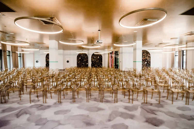
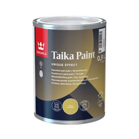
Warm golden shades are created using a pearlescent paint
The conference hall also embodies the unique concept of Vytautas Ego SPA and looks nothing like a standard meeting room. The creative team decided to paint the acoustic ceiling panels in the conference hall gold. This unique idea was only possible because the team of architects found a suitable product: Tikkurila Taika (Gold), a water-based acrylic paint in warm, rich shades of gold. This pearlescent paint is designed for wooden, metal and concrete surfaces and can be used for painting furniture, accent walls, ornaments and other interior details. The fast-drying Tikkurila Taika creates a semi-glossy surface and gives a warmer character to modern interiors.
Durable paints protect wet and high-traffic areas
The paints used for the surfaces in wet premises, staircases, lobbies and foyers had to be particularly durable. For the Vytautas Ego SPA complex, the special-purpose acrylic interior paint Tikkurila Luja 7 was chosen, which protects the painted surface from mould. This paint is suitable for both residential and public wet premises. In addition, Tikkurila Luja 7 has exceptional wear resistance and the paint film and colour can withstand strong detergents and mechanical stress.
Want to learn more and get access to exclusive information?
Feed your creativity with latest trends and grow your know-how about surface treatment solutions. Join Tikkurila Pro Designer - a new arena for creative minds in architecture and interior design.