You’re visiting Tikkurila website from United Kingdom. Would you like to visit the local UK site?
Interior design trends for 2025
Sliding tones, more elegance and unexpected shades together were seen both in Frankfurt at Heimtextil and Ambiente and at Milan Design Week. These are the colour trends for 2025.
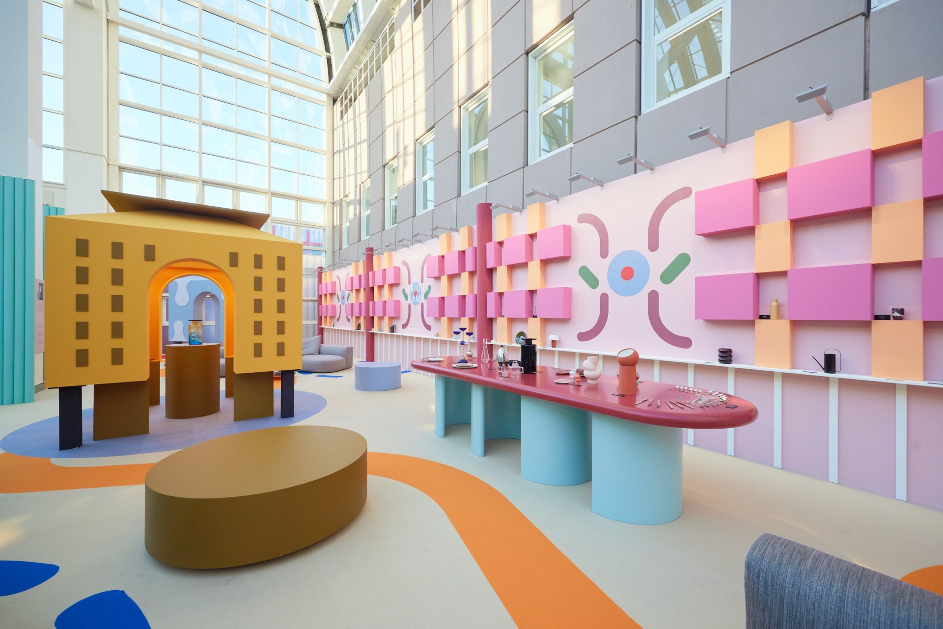
Similarities in future trends could be seen at international design fares at Heimtextil, Ambiente and Milan Design Week. Heimtextil and Ambiente also set a welcoming example of how sustainability should be a part of the interior design industry.
We get a wide analysis of interior design and colour trends from Susanna Björklund, a trend analyst and journalist. She works on the future of design through both societal and visual change. At international design fairs, she finds it easy to spot change. The work of young designers in particular points the way forward.
Subtleties in colour range
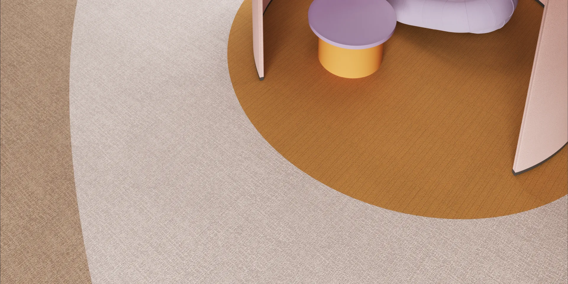
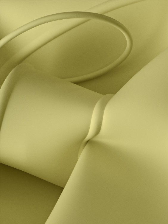
The colour palette at Heimtextil has generally been in line with future trends. This year, Color Authority's Judith van Vliet was responsible for Heimtextil's colour card. The petrol blue seen last year seems to be getting stronger and the beige is sliding towards colder, more yellowish sandy tones. The same could be seen in Milan.
On the other hand, toffee shades seem to be reddening towards more clay-like nuances and with plant-based materials, orange-tinged, yellowish tones are typical. Off-white also stood out in Milan, often with a vanilla-like yellowish tint.
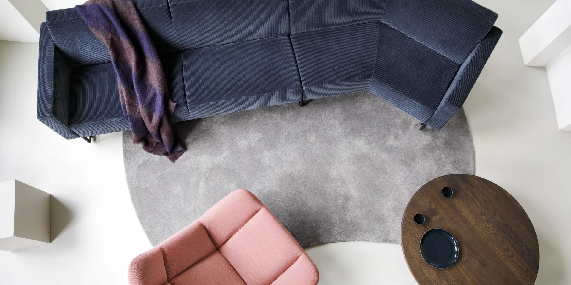
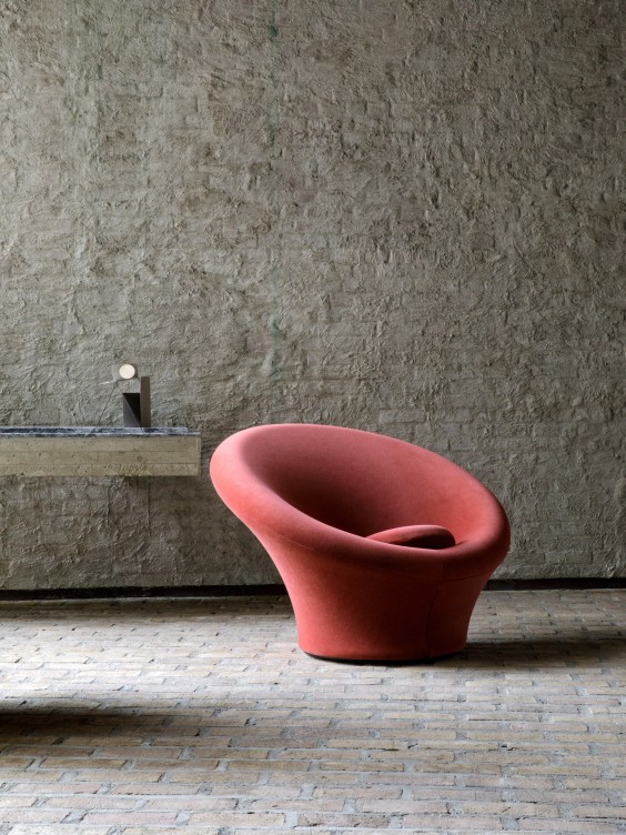
Grey is gaining ground in fashion, having been gone for a while and in Milan it was back in furniture. Some might argue that the power of grey has never waned. With grey, it is worth boldly adding a highlight colour with it, in order not to make the overall look dull. Italian furniture company Artifort combined a navy blue sofa and a chair in rose blush with a grey carpet. Grey works well in textiles.
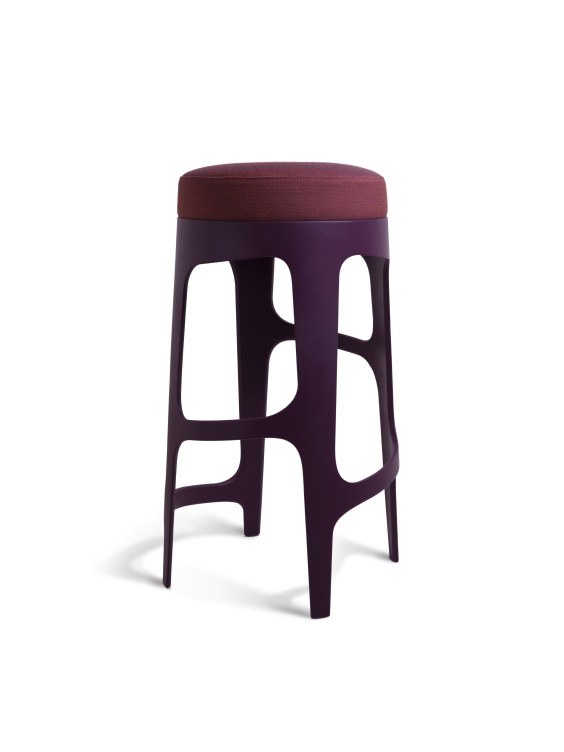
In Milan, the number one colour was clearly burgundy, which is at its most spectacular in high gloss. High-gloss is also making a comeback, with the more elegant design language. Gucci's DesignAncora exhibition presented design classics in burgundy only. At the Salone Satellite exhibition of young designers, Edvin Klasson's stackable, asymmetrical and elegant Hedera bar stool stood out, also in burgundy.
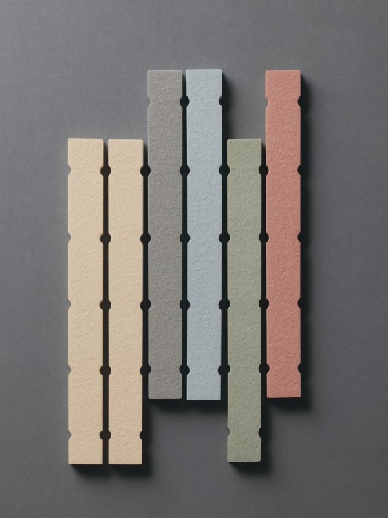
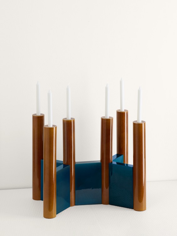
In Milan one of the pioneers is always Mutina Ceramics, and this year is no exception. Petrol, rust and light blue stood out in their exhibition.
Emotions and experiences
We need big changes in the way we consume; less, less often and with better quality. Companies need to produce less novelties. Perhaps the importance of colours will grow in general.
You can create new atmospheres, enliven a space and satisfy the longing to be surrounded by something new simply by changing colour combinations, and by painting walls or furniture.
Trend colours in interior design, in particular, don't change overnight, let alone every year. Interesting colour combinations with an edge are more important than individual trend colours. Mixing unexpected shades together creates a new ambience.
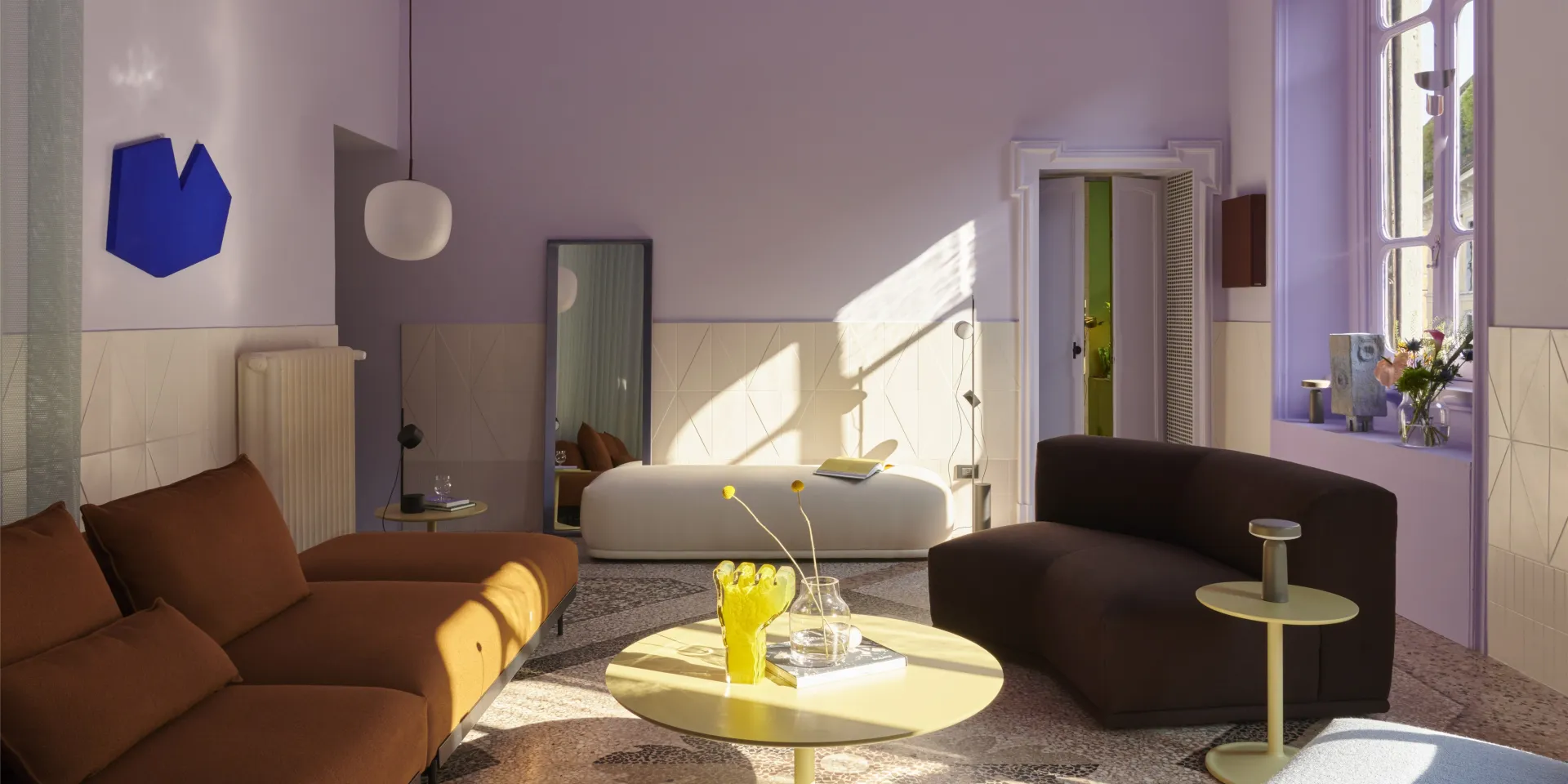
Muuto's showroom in Milan was a breath of fresh air, with sorbet-like pale yellows and lavender purples giving the walls a new look. Contrasts such as furniture in greenish brown and olive green kept the overall look from becoming too syrupy sweet. Pastel tones work best when combined with darker, murky colours.
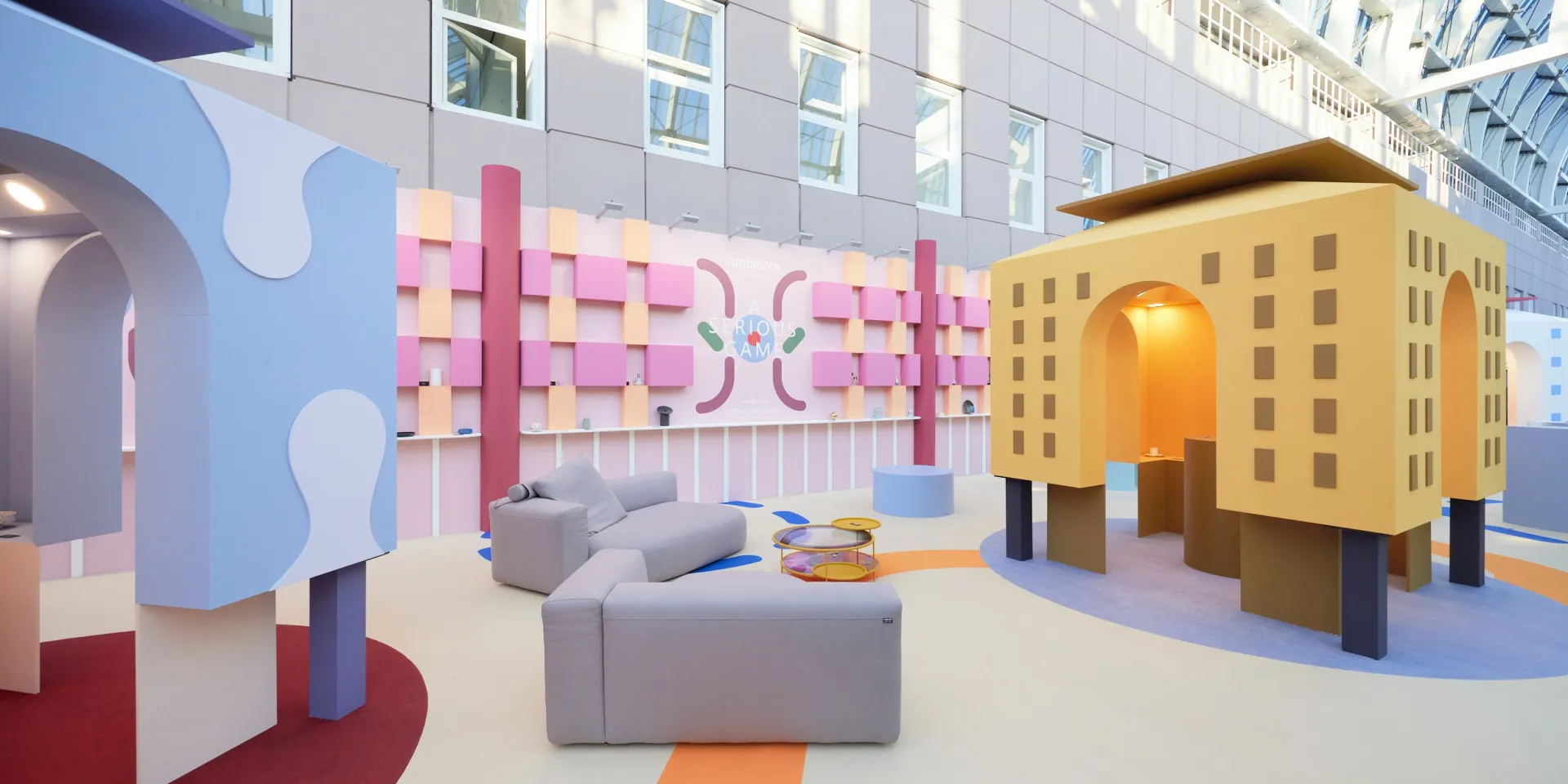
At Ambiente, Elena Salmistraro's positive and cheerful exhibition put a smile on visitors’ faces. The exuberant use of colour, especially on the walls, showed how much can be achieved simply with paint.
Regenerative design
At Heimtextil, the ambitious Regenerative? Moving Beyond Sustainability exhibition by FranklinTill shed light on what regenerative design is all about. In addition to new materials made from waste, environmental impact and the circular economy, among others, the exhibition highlighted the importance of social impact and the collaboration of local people. Restoring biodiversity and broadening the material palette were also mentioned. The huge amount of construction waste is another huge problem. Tarkett's Desso tiles are fully recyclable.
Tanja Kirst Studio uses fibres from plants such as oranges, pineapple, hemp and algae in her textiles. The wall hangings are dyed with vegetable dyes. The end result is contemporary, calm but clearly colourful.
There can be seven colours in a single product and, when woven, there are countless shades.
From fashion to interior design
Fashion trends always have an impact on the world of interior design. The long-held influences of casual street style and sportswear seem to have reached saturation point. Perhaps we are moving towards a more elegant, monochrome and elegant fashion language.
Gucci's change of direction for this spring and next autumn showed the way forward. Dries Van Noten's men's collection for Spring 2025 had a more monochrome feel overall, although there were prints also. A rosy blush shade stood out as a delicate colour amongst the neutrals.
