You’re visiting Tikkurila website from United Kingdom. Would you like to visit the local UK site?
Colour in public environments
How to choose the right colour scale for different indoor and outdoor projects

The right colour scale and thoughtful colour choices can make the difference in creating spaces that are both aesthetic and functional. General colour design principles are a good starting point for different projects, but the challenge is adapting them to fit the needs of each project. The success of colour design hinges on understanding the project brief in question and the specific needs of the space.
When choosing the colour scale, balancing aesthetics with functionality requires careful consideration of the environment, finishes and overall design. Testing colour samples in the actual setting helps ensure they work well with the lighting and other design elements. Additionally, it's important to harmonise the colours with the existing architecture and surroundings, while also considering ease of maintenance, so the chosen palette remains both visually appealing and practical over time.
Ideally, aesthetics should not be compromised by practicality, but in reality, technical and durability requirements often take precedence. A good designer strives to balance these elements, ensuring that functionality doesn't overshadow the visual appeal. For instance, if a bright yellow roof might be essential to a building's concept, but the colour isn't durable, a decision must be made between maintaining the aesthetic vision and addressing the practical need for longevity.
Finding perfect shades for indoor projects
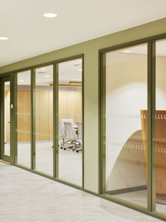
Finding a balance between visual appeal and practical needs is especially important in indoor colour schemes. Key factors to consider include the space's intended use, lighting (both natural and artificial), existing architecture and decor and practical needs such as accommodating users with visual impairments.
For instance, using high-contrast colours can improve visibility and navigation in public spaces while complementing the space's purpose and mood. In specific spaces, like in a care home for individuals with dementia, using distinct, bright colours can also help residents navigate their environment more easily. Additionally, colours need to comply with safety regulations and contribute to a welcoming and inclusive atmosphere in spaces like hospitals or offices.
The challenge lies in finding the perfect shades and ensuring that different materials complement each other. However, this is often easier to manage indoors, as spaces are more confined and lighting is more controlled, meaning seasonal changes or variations in natural light are less of an issue.
Lighting and scale affect the perception of colours outdoors
With outdoor projects it is essential to consider how colours integrate with the building’s architecture and the natural surroundings, as well as their impact on public spaces. For instance, colours that complement the natural landscape help the space blend into its environment while bold contrasts can draw attention to it. Selecting the exterior colour is often more of a challenge than interior colours, and the mistakes are also more visible to the customers.
Colours appear differently in natural light than in colour samples, often looking brighter or altered. This effect is even more pronounced on larger surface areas, where colours can change significantly from how they seem in samples. Testing colours in the actual environment where they will be used is crucial to understanding how they will look in different lighting conditions and at larger scales.
The interaction of natural light, weather and seasons affect colour coordination and nuances. Selecting colours for public spaces requires ensuring they are weather-resistant, harmonise with the surroundings and retain their appearance despite exposure to weather conditions such as UV radiation and rain.
Consideration is part of the basic design principles
Also, understanding the site-specific requirements and the materials used is fundamental. This consideration is part of the basic design principles and the overall planning process. Often structural or technical specifications dictate the product that must be used, and the colour is simply applied on top.
Trendy colours in small quantities
In public environments, trends can be incorporated through smaller, easily changeable elements, while larger areas should remain timeless. Use trendy colours in smaller details or features rather than in the main structural elements. This way, the space reflects current styles but maintains long-term appeal.
In public places where trends are more easily integrated, the colour scheme can align with broader concepts. For instance, a restaurant that regularly updates its concept to stay current might adapt its style with the times.
What tools are there to help select the appropriate colour scale?
Selecting the right colour and shade for public environments is important, because the choice is made for years to come. This is why Tikkurila has created various colour collections: small, curated selections that narrow down the range of colours suitable for specific materials and projects. These collections support the colour selection process by ensuring that both the aesthetic and technical qualities of the colours are appropriate for the intended use.
In addition to our subjective perception of a colour, other factors such as the physical surroundings and lighting as well as the surface material of the painted object affects how a colour is perceived. Therefore, colour samples should be examined in natural surroundings and, if possible, test painting is highly advisable. For test painting purposes, there are Tikkurila colour testers available in sample size pots.
See all colour card for professionals here.

